
Colour
Colour plays a crucial role in setting the emotional tone for our communications. In this section you can find guidance on colour usage for digital and print applications.
Primary colour palette
Our primary colour palette is made up of black, white and gold. Black and white should feature prominently. Black and white are the most accessible of colour combinations which makes communications more open to our diverse audiences and should feature prominently. To ensure this accessibility meets the needs of our users we employ a slightly reduced black and white on digital formats, while in print we use a deeper black and white swatch palette. The slight variation can be seen below. Please ensure you are using the correct versions of the colours, when you are working in either digital or print formats. Gold should only be used for block graphics such as the line on the CTA and doesn’t differ between digital and print formats like black and white.

Our primary digital colours with a reduced black and white

Our primary print colours with a deeper black and white
WHITE
CMYK
C:0 M:0 Y:0 K:0
RGB
R:250 G:250 B:250
HEX
FAFAFA
BLACK
CMYK
C:0 M:0 Y:0 K:100
RGB
R:27 G:27 B:27
HEX
1B1B1B
GOLD
CMYK
C:10 M:30 Y:100 K:20
RGB
R:197 G:154 B:0
HEX
C59A00
60% TINT
30% TINT
The download file below includes the following formats:
- DOCX
Secondary colour palette
Our secondary colour palette exists to provide support to the primary colour palette. It should be used strictly for data representation and infographics only. These colours should never be used to colour text on main headlines or body copy and shouldn’t be used as large block background colours. The secondary palette colours originate from the red and blue of the institutional crest.
Accessibility
A deep tone for each colour has been outlined to be used when text needs to sit on a colour on a chart or infographic. The text colour in this instance should be white.
The lighter tone of these colours should be used for charts and infographics. They should not be used behind text in any instance, with the exception of purple, grey and red as they do pass the accessibility contrast test.
Tints
Tints are made from the lighter swatch of each colour and should not be made from the darker swatch.
All 70% tints of colours should be used for block colours only and not have black or white text applied on top of them. The tints of 50% and below of the lighter colour can have black text sitting on them as they pass accessibility tests and work well for aesthetic purposes.
When using the colours or tints from the colour palette, the strongest visual and most accessible combination is to have them appear on a white background (never black). If text is then being placed on this block colour, then follow the guides set out in the colour chart to direct you to the text colour required.
DEEP GREEN
(for white text only)
CMYK C:100 M:0 Y:95 K:20
RGB R:0 G:120 B:56
HEX 007838
GREEN
(block colours only)*
CMYK C:75 M:0 Y:100 K:0
RGB R:58 G:170 B:53
HEX 3AAA35
TINTS OF
GREEN
70%
Use for block
colours only
50%
Black text can
sit on tints
50% - 15%
30%
15%
DEEP TURQUOISE
(for white text only)
CMYK C:100 M:0 Y:25 K:30
RGB R:0 G:120 B:142
HEX 00788E
TURQUOISE
(block colours only)*
CMYK C:80 M:0 Y:40 K:0
RGB R:0 G:172 B:169
HEX 00ACA9
TINTS OF
TURQUOISE*
70%
Use for block
colours only
50%
Black text can
sit on tints
50% - 15%
30%
15%
DEEP BLUE
(for white text only)
CMYK C:100 M:60 Y:0 K:0
RGB R:0 G:87 B:191
HEX 0057BF
BLUE
(block colours only)*
CMYK C:80 M:40 Y:0 K:0
RGB R:37 G:129 B:196
HEX 2581C4
TINTS OF
BLUE*
70%
Use for block
colours only
50%
Black text can
sit on tints
50% - 15%
30%
15%
DEEP PURPLE
(for white text only)
CMYK C:20 M:40 Y:0 K:49
RGB R:80 G:29 B:131
HEX 501D83
PURPLE
(white text & block colours)
CMYK C:75 M:75 Y:0 K:0
RGB R:94 G:79 B:156
HEX 5E4F9C
TINTS OF
PURPLE*
70%
Use for block
colours only
50%
Black text can
sit on tints
50% - 15%
30%
15%
DEEP GREY
(for white text only)
CMYK C:0 M:0 Y:0 K:90
RGB R:60 G:60 B:59
HEX 3C3C3B
GREY
(white text & block colours)
CMYK C:0 M:0 Y:0 K:80
RGB R:88 G:89 B:91
HEX 58595B
TINTS OF
GREY*
70%
Use for block
colours only
50%
Black text can
sit on tints
50% - 15%
30%
15%
DEEP RED
(for white text only)
CMYK C:0 M:100 Y:95 K:5
RGB R:194 G:0 B:25
HEX C20019
RED
(white text & block colours)
CMYK C:0 M:100 Y:100 K:0
RGB R:227 G:6 B:19
HEX E30513
TINTS OF
RED*
70%
Use for block
colours only
50%
Black text can
sit on tints
50% - 15%
30%
15%
DEEP PINK
(for white text only)
CMYK C:0 M:100 Y:35 K:0
RGB R:219 G:6 B:97
HEX DB0661
PINK
(white text & block colours)*
CMYK C:0 M:80 Y:20 K:0
RGB R:234 G:82 B:132
HEX EA5284
TINTS OF
PINK*
70%
Use for block
colours only
50%
Black text can
sit on tints
50% - 15%
30%
15%
DEEP ORANGE
(for white text only)
CMYK C:0 M:85 Y:100 K:5
RGB R:207 G:69 B:39
HEX CF4527
ORANGE
(white text & block colours)*
CMYK C:0 M:60 Y:80 K:0
RGB R:240 G:127 B:60
HEX F07F3C
TINTS OF
ORANGE*
70%
Use for block
colours only
50%
Black text can
sit on tints
50% - 15%
30%
15%
*Some of the directions given in the colour blocks are set in white and state that the colour should be used for block colours only and as such white text shouldn’t be used on this colour. White text is only used in this instance for information purposes only and shouldn’t be applied to block colours.
The download file below includes the following formats:
- DOCX
Secondary colour palette examples
Data representation examples
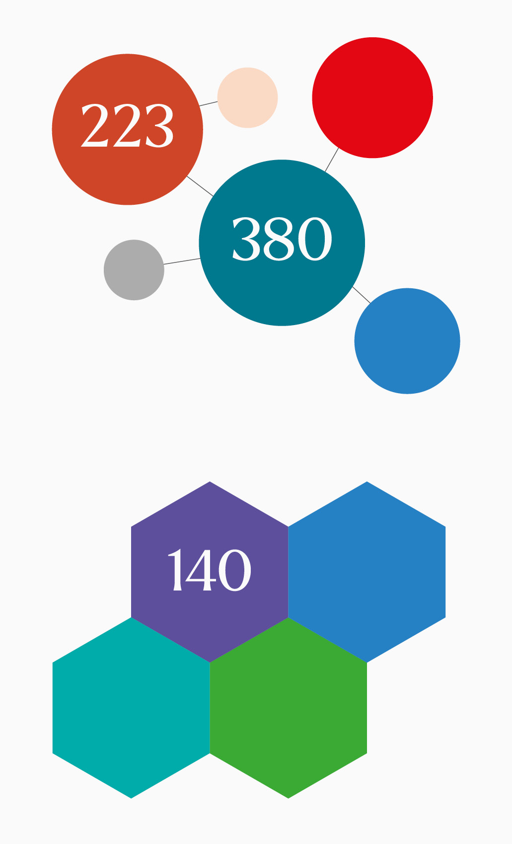
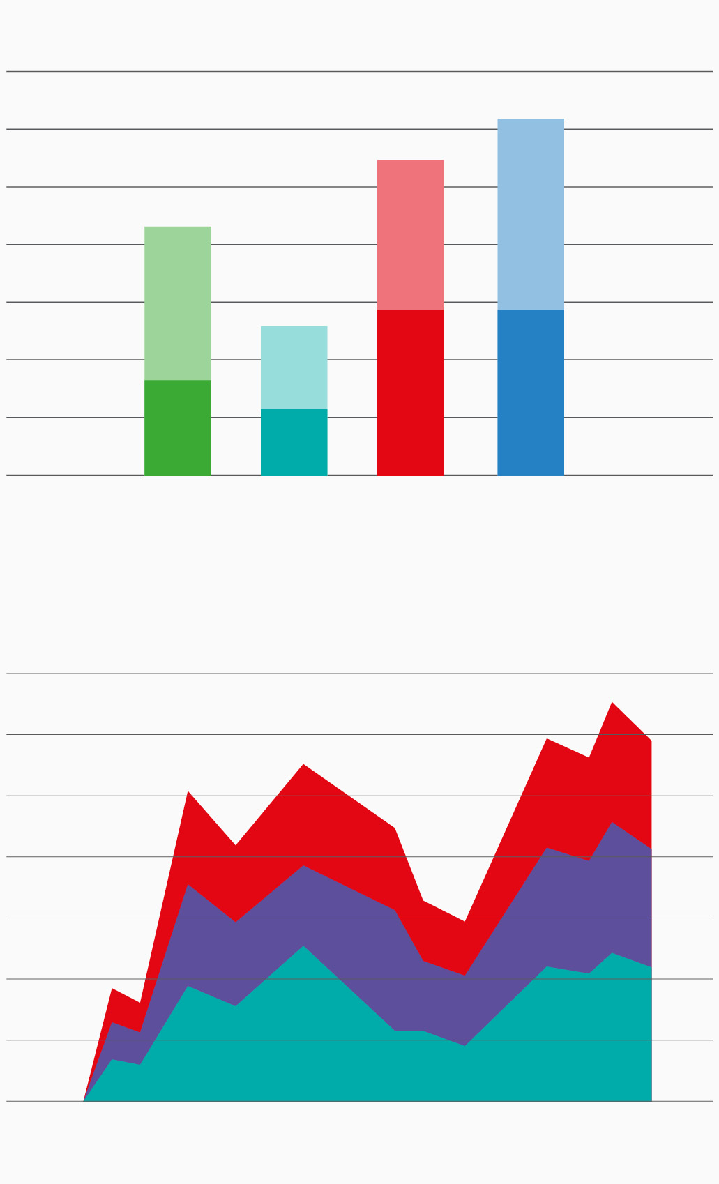
Here are some visual examples of how the secondary colour palette works on charts, graphs and supporting illustrations. Please refer to the accessibility guidance in the previous section.
Colour usage chart
Using colour proportions correctly is key to reflect the understated confidence of the University. The colour usage chart below is a visual indicator to refer to as it ensures the predominance of the primary colour palette.