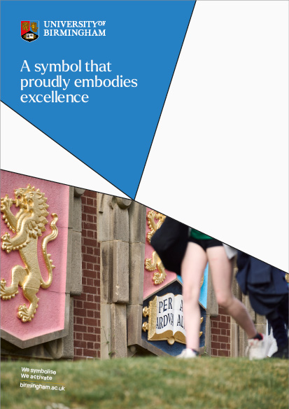
Brand Essentials
Introduction
This toolkit is designed to help staff understand and use our brand. This section provides usage guidance on the introductory elements of our brand identity.
Our logo
Our logo embodies the essence of our University and plays a fundamental role in establishing our brand presence globally. When using the University logos, visual integrity must be maintained at all times.
Please download the latest logo suite to apply to all branded collateral going forward. Older logo files from previous design collateral should be deleted.
- Crest
- Wordmark
Primary logo
University of Birmingham’s primary use logo is landscape. The logo exists in positive and negative formats to maintain visual strength across different formats and backgrounds. Monochrome versions of the logo are available for special case use and can be requested from the Brand Team.
Positive logo
Negative logo
Mono black logo
Mono white logo
Our logos are available in CMYK and RGB in the following formats:
- AI
- JPG
- PNG
- SVG
Please contact the Brand Team to access these additional formats. JPG and PNG versions of the primary logo can be found in the download link below:
Primary stacked logo
A stacked version of the logo is available to use on portrait formats, such as skyscraper banners and pull-up stands.
Positive logo
Negative logo
Mono white logo
Mono black logo
Our logos are available in CMYK and RGB in the following formats:
- AI
- JPG
- PNG
- SVG
Please contact the Brand Team to access these additional formats. JPG and PNG versions of the primary stacked logo can be found in the download link below:
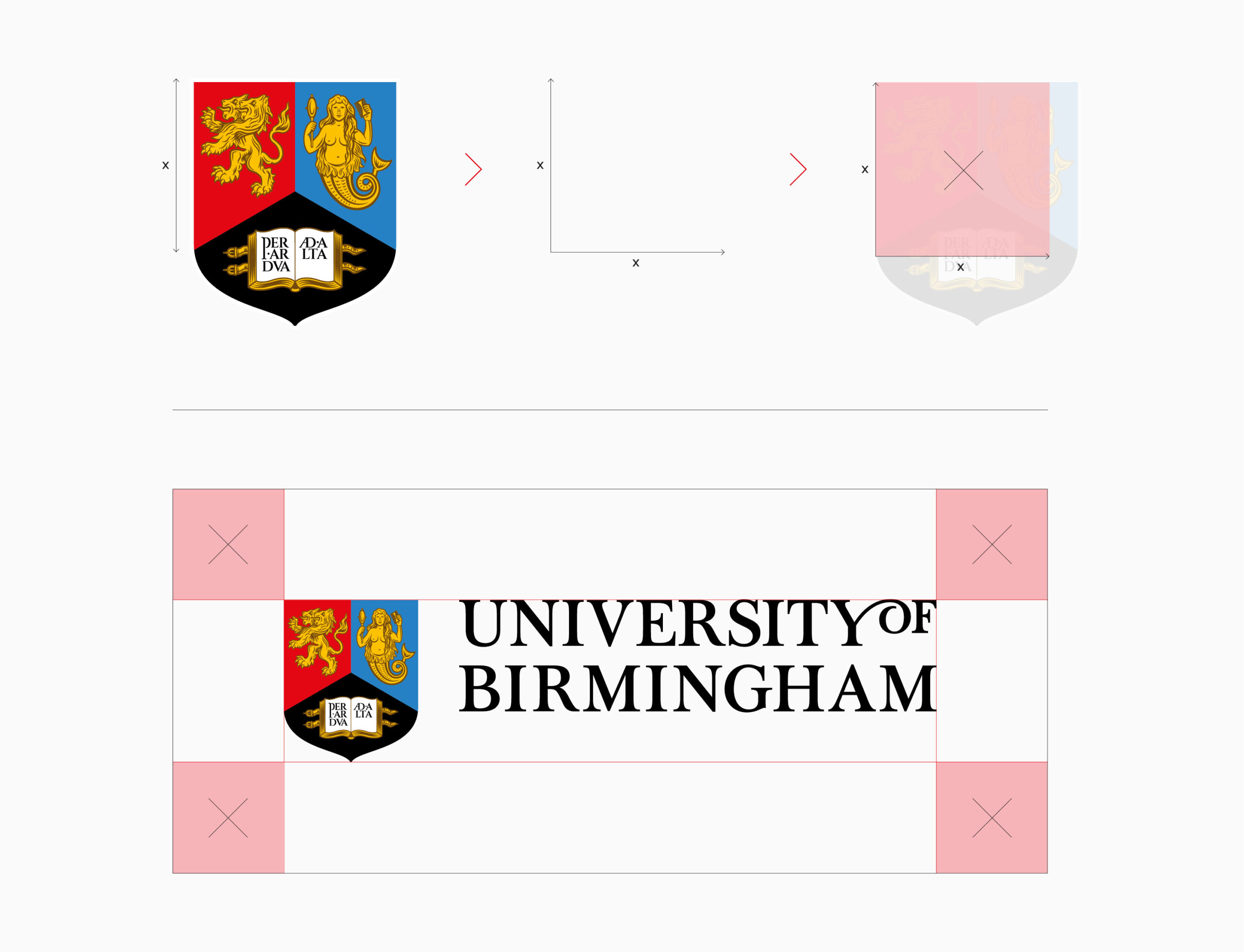
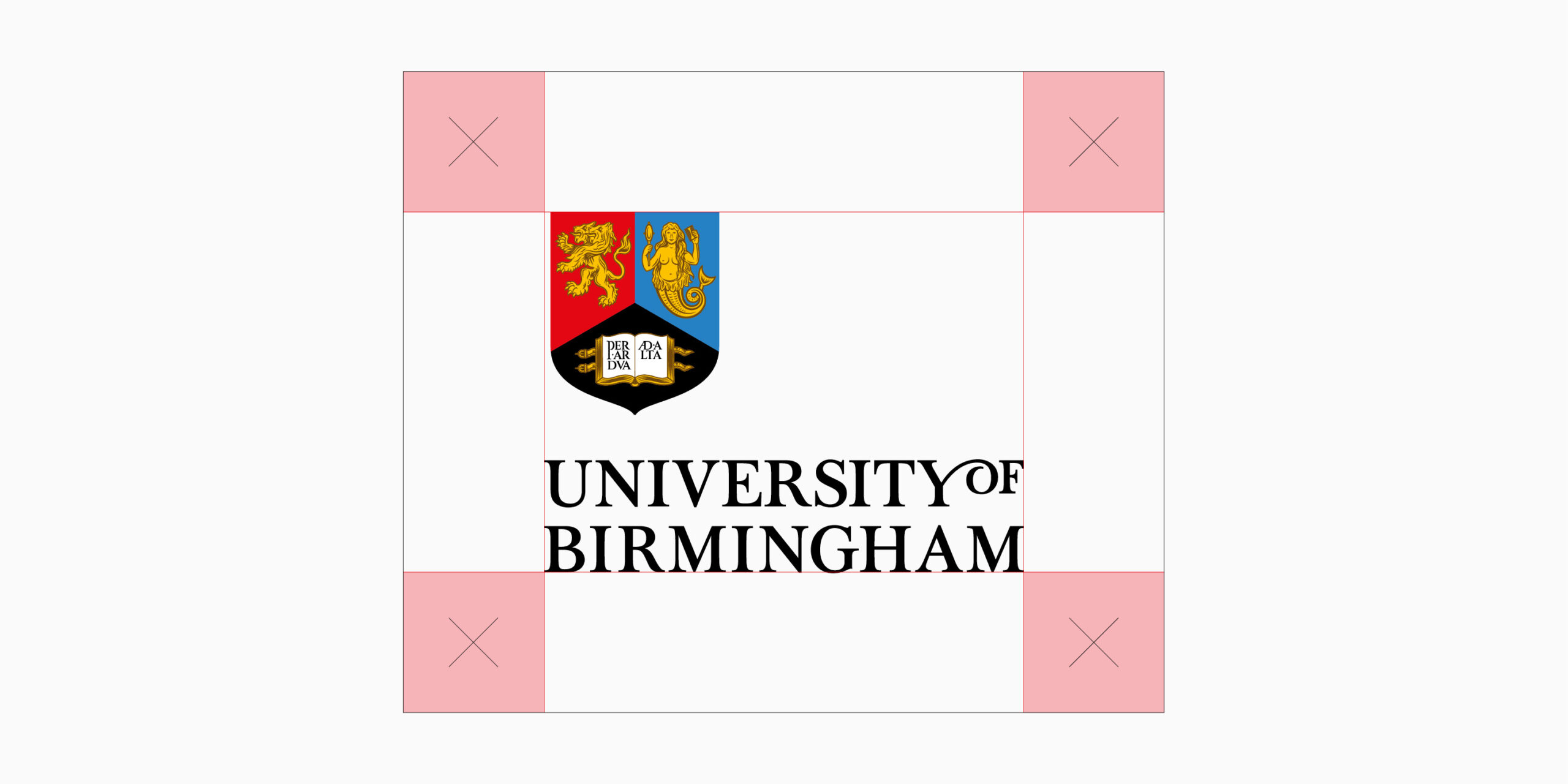
Minimum clear space
To protect the visual integrity of our logo, minimum clear space area has been set. Please refer to sizing formula below for how clear space is calculated. No other graphic elements should encroach this area. When placing the logo on a full colour image, please ensure there is good contrast between the logo and image. The same clear space rule and formula apply to both Primary and Primary Stacked versions of the logo.
In cases where this rule can’t be applied because of limited room on a format, please contact the University’s Brand Team, so a best case scenario can be decided on.
Logo usage
The overview examples below demonstrate how to use our logos correctly and what must be avoided. Altering or manipulating logos is strictly prohibited as this may make the logo inaccessible to our audiences.
This guidance applies to other versions, variations and lockups within our logo suite. If a new logo lockup is needed for any area within the ecosystem, then please contact the Brand Team for further guidance.
Be clear and legible
Use a high contrast background image

Use correct version for format

Rotate

Squeeze or stretch

Reconfigure

Use unapproved colours

Use drop shadow

Place in container

Crop

Recreate
Place on low contrast, busy backgrounds
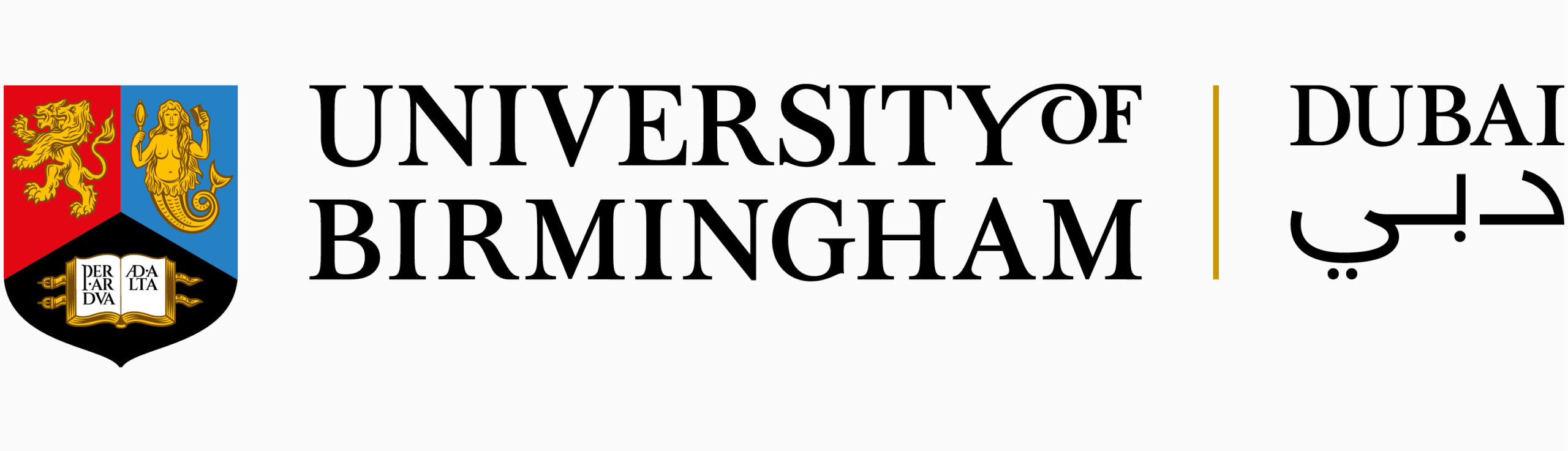
Primary University logo - campuses
In order to recognise the importance of our global campuses, these logos will include the name of the campus location. Where appropriate the name of the campus location can appear in the local language – as in the case of Dubai.
Conditions of use:
- In all communications, both printed and digital where they represent a University campus, such as in Dubai.
- To be applied to both internal and external audiences
- Must always be used in adherence with the University’s brand guidelines.
- Cannot be used with any other logo, internal or external without prior approval.
Logos for the Dubai campus are available in CMYK and RGB in the following formats:
- AI
- JPG
- PNG
- SVG
Please contact the Brand Team to access these additional formats. JPG and PNG versions of the primary logo can be found in the download link below:
Logos for the Dubai campus are available in CMYK and RGB in the following formats:
- AI
- JPG
- PNG
- SVG
Please contact the Brand Team to access these additional formats. JPG and PNG versions of the primary stacked logo can be found in the download link below:
Secondary logos
Secondary University logo
Where individual Colleges or Professional Services Divisions are communicating, a Secondary University logo can be used. This is a formal combination of the University logo with an individual official unit’s name. This helps to identify the origin of local communications whilst also demonstrating a strong belonging to the University.
Criteria for using the Secondary University logo:
- An area that forms part of University’s organisational structure such as a College, School, Departments, or Division.
- All research centres / institutes except those that are classified as a ‘Major Nationally Recognised Research Centre’ (see exceptions)
University of Birmingham College of Arts and Law logo
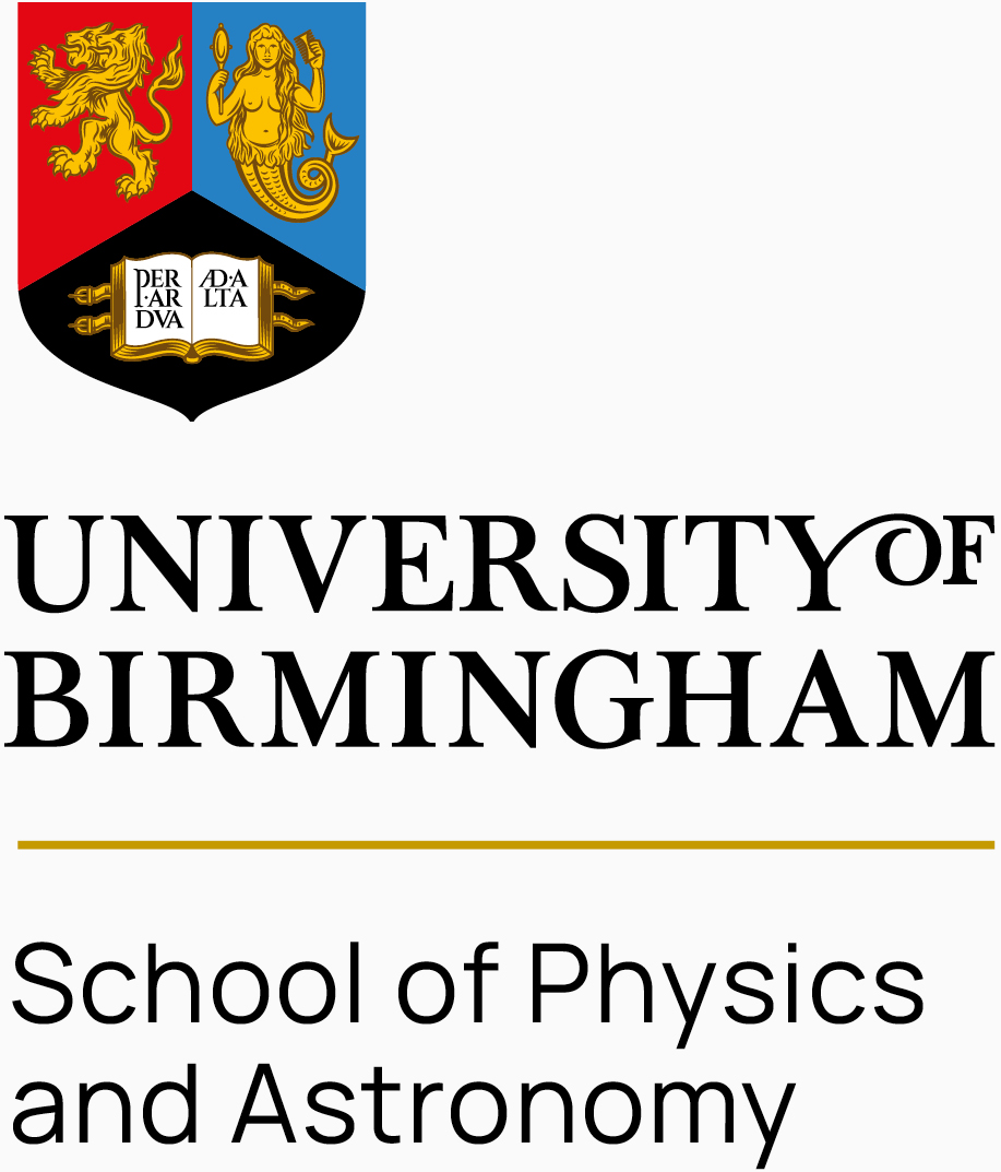
University of Birmingham School of Physics and Astronomy logo
Exceptions:
Major nationally recognised research centres and University Research Institutes
Aligned with the reclassification of all research centres and institutes across the University, only those research centres classified as a ‘Major Nationally Recognised Research Centre’ or ‘University Research Institute’ are permitted to have a graphical device, along with the typographical logo.
Those research centres and institutes that not classified as such adopt the Secondary University Logo.
Criteria for using this:
- Formally classified as a ‘major nationally recognised research centre’ or ‘University Research Institute’
- Graphical device must be in mono and text in manrope.
- The name of the centre / institute must be written out and not abbreviated.
- Where existing graphical devices exist, these may need to be redrawn.
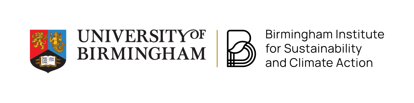
Birmingham Institute for Sustainability and Climate Action landscape

Birmingham Institute for Sustainability and Climate Action landscape
Cultural destinations
Cultural assets that operate as a visitor destination and that need to compete with other cultural attractions are permitted to use a graphical device in combination with a typographical logo.
Criteria for using this:
- Graphical device must be in mono and text in manrope.
- The University Logo and Crest should always appear at the top when logos are stacked.
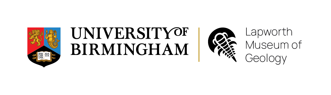
University of Birmingham Lapworth Museum of Geology logo

University of Birmingham Lapworth Museum of Geology logo stacked
Co-branding: equal or significant partner
When the University is an equal or significant partner in a partnership, collaboration the partner logo may be used in lock up with the University logo. This is generally on occasions where it is deemed to be reputationally advantageous and signals a strong strategic relationship.
Criteria for using this:
- A partner should only use the University logo if a formal partnership agreement, sponsorship agreement, Memorandum of Understanding, or equivalent formal agreement exists.
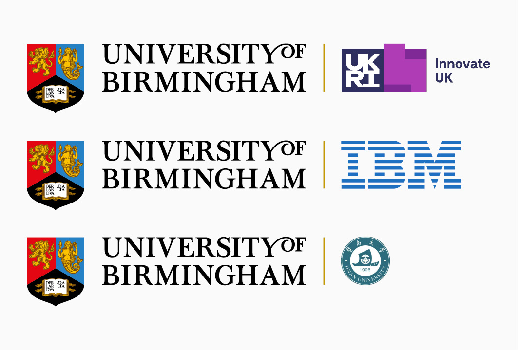
Co-branding: multiple partners
When multiple partners come together to form an organisation, it is permitted to create a unique logo and identity that is separate to the Primary University logo.
In the instance of multiple partners, all their logos should be included on any collateral, with logos placed left to right with the University of Birmingham logo always placed first whenever possible. Space between logos is as indicated, logos are to be sized to create equality to all partner organisations. The gold line is not required.
Within some partnerships, it can be helpful to clarify the relationship between the two partners, and in this case the gold separation line is not used.
Criteria for using this:
- Where the University of Birmingham is a lead partner in a consortium, it should be placed on the left.

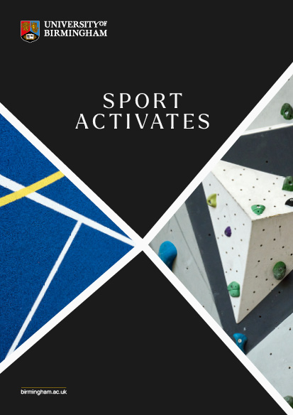
Lines of intent
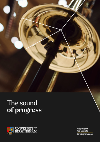
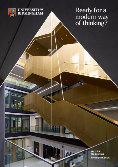
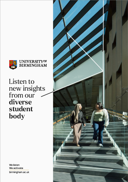
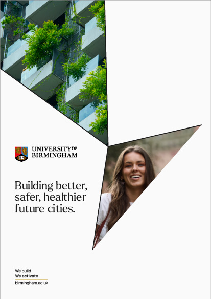
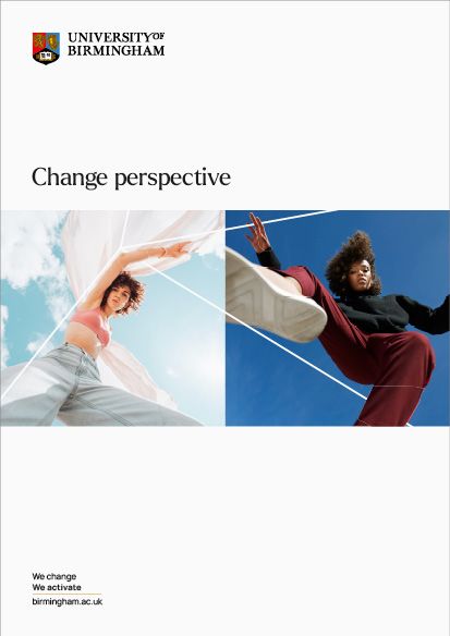
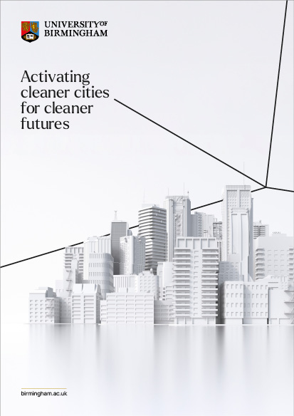
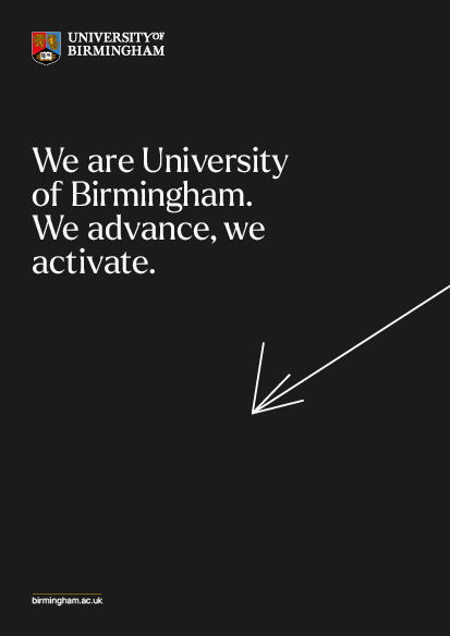
The lines of intent are a vital part of our brand identity. When used correctly and consistently, they create dynamic impact across our brand communications.
Originally derived from the centre of our crest, the lines of intent have the ability to move, stretch and point in different directions; a strong visual expression of how the University is able to look at any challenge and purposefully focus expertise to create solutions.


Lines of intent usage
The examples provided here should act as inspiration when creating your own communication pieces. The lines of intent allow for endless creative and adaptable design layouts. When combined with our brand photography, typography and well-considered clear or white space, the distinct University of Birmingham style is created.
Use as a point of focus
Align with angles in photography
Align with angles in photography

Create containers for text
Create containers for text

Create refracting imagery
Split and run behind imagery
Split and run behind imagery
Create lines of intent that have no meaning
Create awkward angles and shapes
Compromise text accessibility on backgrounds
Use more than one set of Lines of Intent on a standard format

Crop images badly
Create lines of intent that are too thick or thin

Use a drop shadow on the lines of intent
Use secondary colours for the lines of intent
There is potential for inconsistency and dilution of the system. Familiarise yourself with these guides and use creative instinct to create on-brand collateral. Some sample incorrect executions are shown below.
- Poorly placed lines of intent
- Illegible text placement
- Awkward image crops
- Lines of intent that are too thick/thin
- Misuse of colour
Colour
Colour plays a crucial role in setting the emotional tone for our communications. In this section you can find guidance on colour usage for digital and print applications.
Primary colour palette
Our primary colour palette is made up of black, white and gold. Black and white should feature prominently. Black and white are the most accessible of colour combinations which makes communications more open to our diverse audiences and should feature prominently. To ensure this accessibility meets the needs of our users we employ a slightly reduced black and white on digital formats, while in print we use a deeper black and white swatch palette. The slight variation can be seen below. Please ensure you are using the correct versions of the colours, when you are working in either digital or print formats. Gold should only be used for block graphics such as the line on the CTA and doesn’t differ between digital and print formats like black and white.

Our primary digital colours with a reduced black and white

Our primary print colours with a deeper black and white
WHITE
CMYK
C:0 M:0 Y:0 K:0
RGB
R:250 G:250 B:250
HEX
FAFAFA
BLACK
CMYK
C:0 M:0 Y:0 K:100
RGB
R:27 G:27 B:27
HEX
1B1B1B
GOLD
CMYK
C:10 M:30 Y:100 K:20
RGB
R:197 G:154 B:0
HEX
C59A00
60% TINT
30% TINT
The download file below includes the following formats:
- DOCX
Secondary colour palette
Our secondary colour palette should be used strictly for data representation and iconography only. The colours should never be used to colour text on main headlines or body copy and shouldn’t be used as a large block background colour.
Please note that in instances where text needs to appear on a chart or iconography, the deep colours from the secondary palette should be utilised with white coloured text only. Text should never be set in black against the deep or standard colours.
The tints visualised below are derived from the standard colours. The 70% tint should be used for block colours only and should not have text set on it. Tints that are 50% and below can have black text set on them.
DEEP GREEN
(for white text only)
CMYK C:100 M:0 Y:95 K:20
RGB R:0 G:120 B:56
HEX 007838
GREEN
(block colours only)*
CMYK C:75 M:0 Y:100 K:0
RGB R:58 G:170 B:53
HEX 3AAA35
TINTS OF
GREEN
70%
Use for block
colours only
50%
Black text can
sit on tints
50% - 15%
30%
15%
DEEP TURQUOISE
(for white text only)
CMYK C:100 M:0 Y:25 K:30
RGB R:0 G:120 B:142
HEX 00788E
TURQUOISE
(block colours only)*
CMYK C:80 M:0 Y:40 K:0
RGB R:0 G:172 B:169
HEX 00ACA9
TINTS OF
TURQUOISE*
70%
Use for block
colours only
50%
Black text can
sit on tints
50% - 15%
30%
15%
DEEP BLUE
(for white text only)
CMYK C:100 M:60 Y:0 K:0
RGB R:0 G:87 B:191
HEX 0057BF
BLUE
(block colours only)*
CMYK C:80 M:40 Y:0 K:0
RGB R:37 G:129 B:196
HEX 2581C4
TINTS OF
BLUE*
70%
Use for block
colours only
50%
Black text can
sit on tints
50% - 15%
30%
15%
DEEP PURPLE
(for white text only)
CMYK C:20 M:40 Y:0 K:49
RGB R:80 G:29 B:131
HEX 501D83
PURPLE
(white text & block colours)
CMYK C:75 M:75 Y:0 K:0
RGB R:94 G:79 B:156
HEX 5E4F9C
TINTS OF
PURPLE*
70%
Use for block
colours only
50%
Black text can
sit on tints
50% - 15%
30%
15%
DEEP GREY
(for white text only)
CMYK C:0 M:0 Y:0 K:90
RGB R:60 G:60 B:59
HEX 3C3C3B
GREY
(white text & block colours)
CMYK C:0 M:0 Y:0 K:80
RGB R:88 G:89 B:91
HEX 58595B
TINTS OF
GREY*
70%
Use for block
colours only
50%
Black text can
sit on tints
50% - 15%
30%
15%
DEEP RED
(for white text only)
CMYK C:0 M:100 Y:95 K:5
RGB R:194 G:0 B:25
HEX C20019
RED
(white text & block colours)
CMYK C:0 M:100 Y:100 K:0
RGB R:227 G:6 B:19
HEX E30513
TINTS OF
RED*
70%
Use for block
colours only
50%
Black text can
sit on tints
50% - 15%
30%
15%
DEEP PINK
(for white text only)
CMYK C:0 M:100 Y:35 K:0
RGB R:219 G:6 B:97
HEX DB0661
PINK
(white text & block colours)*
CMYK C:0 M:80 Y:20 K:0
RGB R:234 G:82 B:132
HEX EA5284
TINTS OF
PINK*
70%
Use for block
colours only
50%
Black text can
sit on tints
50% - 15%
30%
15%
DEEP ORANGE
(for white text only)
CMYK C:0 M:85 Y:100 K:5
RGB R:207 G:69 B:39
HEX CF4527
ORANGE
(white text & block colours)*
CMYK C:0 M:60 Y:80 K:0
RGB R:240 G:127 B:60
HEX F07F3C
TINTS OF
ORANGE*
70%
Use for block
colours only
50%
Black text can
sit on tints
50% - 15%
30%
15%
The download file below includes the following formats:
- DOCX
Typography
Our fonts are a visual expression of our brand voice. We use two typefaces: Larken for headlines and statements and Manrope for body copy. To ensure that our communications are accessible, we recommend using only two weights of Larken and Manrope: regular and bold.
These fonts should be used in all University communications such as printed and digital materials such as brochures, official reports and event banners, through to marketing campaigns, and designed resources like a PowerPoint presentation for a high-profile conference.
LEADING
100 - 120% of point size
KERNING
Metric
TRACKING
0/100/200pt
Our new brand font, Larken, is a licensed font which requires access to Adobe Fonts for use. If you do not have access to Adobe Fonts, we would recommend purchasing from Ellen Luff directly.
LEADING
120% of point size
KERNING
Metric
TRACKING
120% of
The download file below includes the following formats:
- TTF
Our typeface for Arabic text is Alexandria (in light and medium weights), which is a freely available Google font.
The download file below includes a link to a Google website to download the Alexandria font:
Everyday typefaces
For everyday usage such as in Office 365, we use default typefaces; Times New Roman is used instead of Larken and Arial is used instead of Manrope. Both of these default typefaces come pre-installed on Mac & PC and should be selected by internal staff for everyday working. For example, our weekly University All Staff Briefing will utilise these everyday fonts.
By using the everyday typefaces, it ensures that when documents are sent externally, they remain accessible and fonts don’t corrupt if the recipient doesn’t have Larken or Manrope installed on their device. This can make documents inaccessible and avoids having to create pdfs which can also present accessibility challenges.
We recommend using only two weights for both Times New Roman and Arial, Regular and Bold. Basic rules around typesetting can be seen in the diagram below and in the typographic principles section of the portal.
These everyday typefaces must not be used in design programmes where our primary typefaces are compatible, such as Adobe InDesign and Illustrator. When designing outward facing brand communications or high-level presentations, our primary typefaces should be used. These should ideally be designed by those who have access to industry level design software and able to run our primary typefaces on their computers.
Please contact the Brand Team for more information around access to our primary typefaces.
LEADING
100 - 120% of point size
KERNING
Metric
TRACKING
0
LEADING
120% of point size
KERNING
Metric
TRACKING
0
'We activate' sign off
A powerful expression of our brand philosophy is our ‘We activate’ sign-off. This is a two-sentence, open-sourced sign-off line that is used as part of the call-to-action across our communications. This CTA sign-off is compulsory when the word ‘Activate’ or any variation of it (e.g. activating) is not being used as part of a headline statement (See Example 1). There will, of course, be instances of ‘functional’ communication where the CTA is not required e.g. allergy information. Please check with the Brand Team if you are unsure.
This is a two-sentence, open-sourced sign-off line that is used as part of the call-to-action across our communications. This CTA sign-off should be used when the word ‘Activate’ or any variation of it (e.g. activating) is not being used as part of a headline statement (See Example 1).

Example 1

Example 2
In examples where the word ‘Activate’ or variations of it are being used as part of the headline statement, a URL-only version of the CTA has been created (see Example 2).
Both two-line and URL-only versions of the sign-off have been set up within the templates. Please only use the artwork files. Do not recreate the sign-off.
|
We ... An open-sourced statement so Institutes, Centres, Departments can create their own versions specific to their area of work. |
An open-sourced statement so Institutes, Centres, Departments can create their own versions specific to their area of work. |
|
|
We activate Underpinned by and external expression of the brand philosophy. |
Underpinned by and external expression of the brand philosophy. |
|
birmingham.ac.uk Our web address always present for brand recognition |
Our web address always present for brand recognition |
Tone of voice
To establish a consistent tone of voice, we have developed guidelines that outline the preferred tone and style with some examples of messaging.
These guidelines should be considered when developing any marketing and communication materials. It’s important that everyone involved in creating content or writing on behalf of the University understands and considers these guidelines in order to maintain consistency.
Think of these guidelines as helpful directions rather than a strict code of conduct. They are designed to inspire your writing and complement it. This guide isn’t a formula, but rather a foundation.
The full tone of voice guidelines are available by clicking the link below where you will also find examples of copy in different contexts.
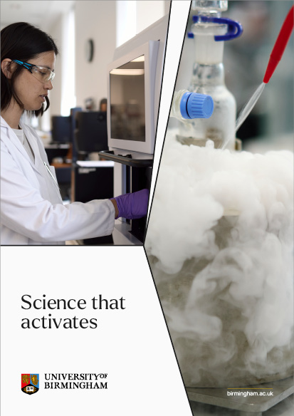
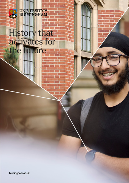
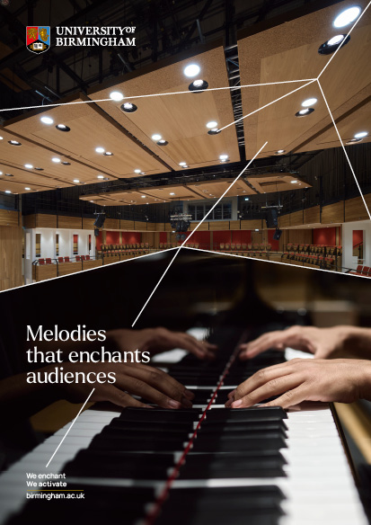
Photography
Photography is one of most powerful brand assets for engaging with our target audiences. A bank of images has been created to support communications which reflect our new brand positioning and our understated confidence. Please use only what is available in the bank of images provided as great care has been taken to maintain consistency in its curation.
Below is a link to a University of Birmingham SharePoint folder with approved imagery:
We’ve divided our photography into six groups, to capture the fullest extent of our reach and influence. These areas are:
- People
- Place
- Research and Innovation
- Education and Learning
- Civic University
- Abstract Conceptual
To help in your decision making when choosing or taking photography for these six groups, we have split our style of photography into three tiers:
Tier one is for everyday photography that focuses on: our people, campus, work and impact locally and nationally.
Tier one

People: Every day student
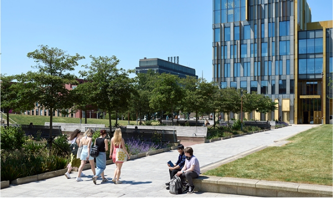
Place: Campus life

Research and Innovation: Lab work

Education and Learning: Library study

Civic University: Community project
Tier two photography is for campaigns or high-impact messaging. There will be the opportunity to art direct our own photoshoots for specific campaign briefs. This will most commonly be done, however, by purchasing high-end stock photography from companies such as Getty.
Tier two

People: Every day student
Place: Cityscape

Research and Innovation: Impact

Education and Learning: Deeper insight

Civic University: Action
Tier three is for conceptual and abstract imagery, where we are looking to communicate ideas and connect with our audience on an emotional level in a way that illustrative photography can’t.
Tier three


People
This tier should be seen as photos for everyday use throughout our wide range of communication collateral. This style should capture a sense of daily life from the perspective of students and staff; real moments that have a feeling of authenticity.
These photos have a slightly pared back, under undersaturated look. This is a brand differentiator that will set us apart from other universities who tend to use staged and overly treated photos. When taking photos, some key factors to consider and details to capture include:
- A mix of shallow depth of field and deep focus
- Creating a sense of documentary realism
- Natural lighting
- Candid and real life moments of people on campus
- A mix of smiling and more natural facial expression
- Zoomed in details
- Interesting perspectives
- Areas in and out of focus
- Shooting through structures and people
- Shapes and angles that mimic the Lines of Intent
What to avoid
To create a clearer picture of the type of imagery that is on-brand, it’s helpful to show what should be avoided:
- Staged, unnatural and cut-out photographs
- Clichéd themes and metaphors
- Clip art and off-brand illustrations
- Dated looking CGI imagery that is overly complex


Video
Video is a powerful marketing tool to both engage and inform our audiences.
This Brand Essentials section should only be used for basic video production and not for campaign level video creation. For more information on developing a campaign video collateral, please contact the Brand Team.
Below are some practical tips and guidance on how you can appropriately use our intros and outros, lower thirds, and call to action. By following this guidance, you can create captivating opening and closing scenes that leave a lasting brand impression.
With the aid of templates and tutorials, these assets can be repurposed for various videos without the need for advanced animation to be carried out.
Intro
The usage of the intro will be on primarily tier two related content as the intro isn’t a necessity but can be a good way of starting content (if applicable). The intro will be supplied as a MOV. file and can be placed on top of the video content.
Outro
For all video content, an outro is a requirement. There are two outros, one for daily use content and the other for our hero video style content.
Tier two outro
This will be dedicated to daily use videos where a less cinematic outro is needed which will include a URL and CTA. The outro will be provided as an AE. File so that the URL and CTA be customised.
A link to the tutorials on each video is available, this will advise on how the animation files work as well as how to export the final video as an .MOV file
Lower thirds
For any piece to camera content, especially when interviewing members of staff and professionals, lower thirds are essential. The lower thirds will cover both tiers and for consistency will remain the same in design. There will be a static version of the lower thirds available as well as options that accommodate different name and title lengths. For this the deliverables will be an AE.file.
A link to the tutorials on each video is available, this will advise on how the animation files work as well as how to export the final video as an .MOV file
Call-to-action
Call-to-actions, URLs, captions and subtitles should be in the Arial typeface.
Credits
There should be no creator/film-maker credits at the end of any video.
Resources and downloads
Downloadable letterheads, email signatures and PowerPoint templates can be found on the Resources & Templates page.
Below is a link to this page: