
Brand System
Overview
Lines of intent
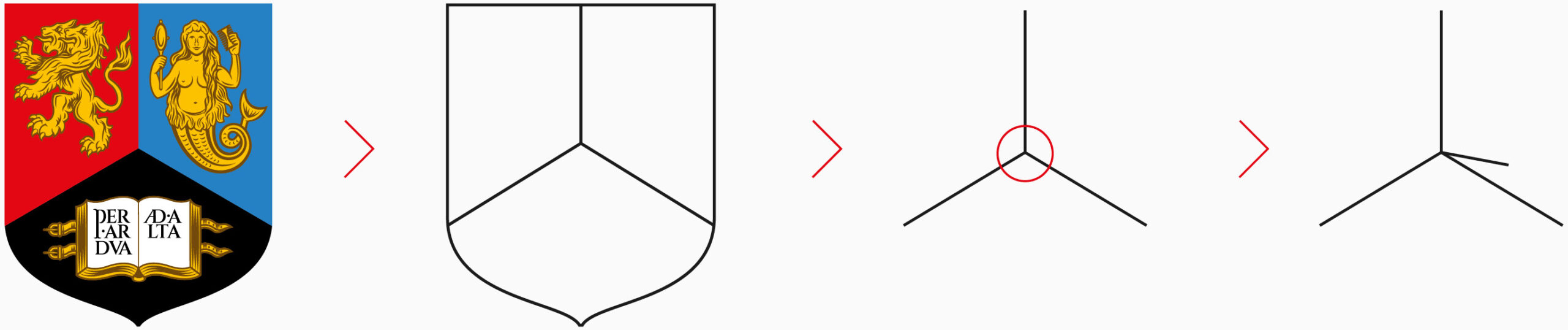
The brand system we use to build our visual collateral is inspired by the shape of the University crest. The system is extremely flexible, allowing us to create varied brand communication design layouts.
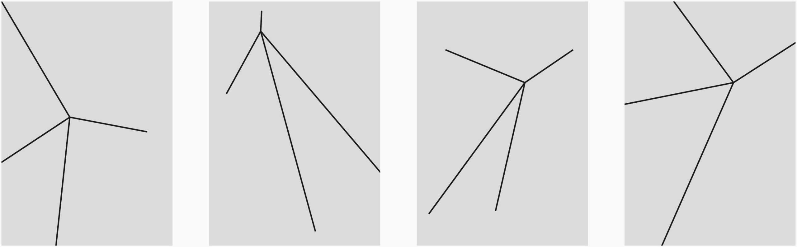
By deriving the tripod shape from the centre of the crest, this was viewed as being an aerial view, in which a fourth spoke of the line device was hidden. By changing angle and perspective, this fourth spoke is revealed. This additional spoke gives the line device the ability to move and stretch in different directions.
This shape and movement is reflective of how the University is able to step back, assess a situation and then with active intent, seek out new solutions, the brightest minds and advanced thinking to take on the biggest challenges. With this in mind, we refer to the line device as the ‘lines of intent’.
Dot matrix grid
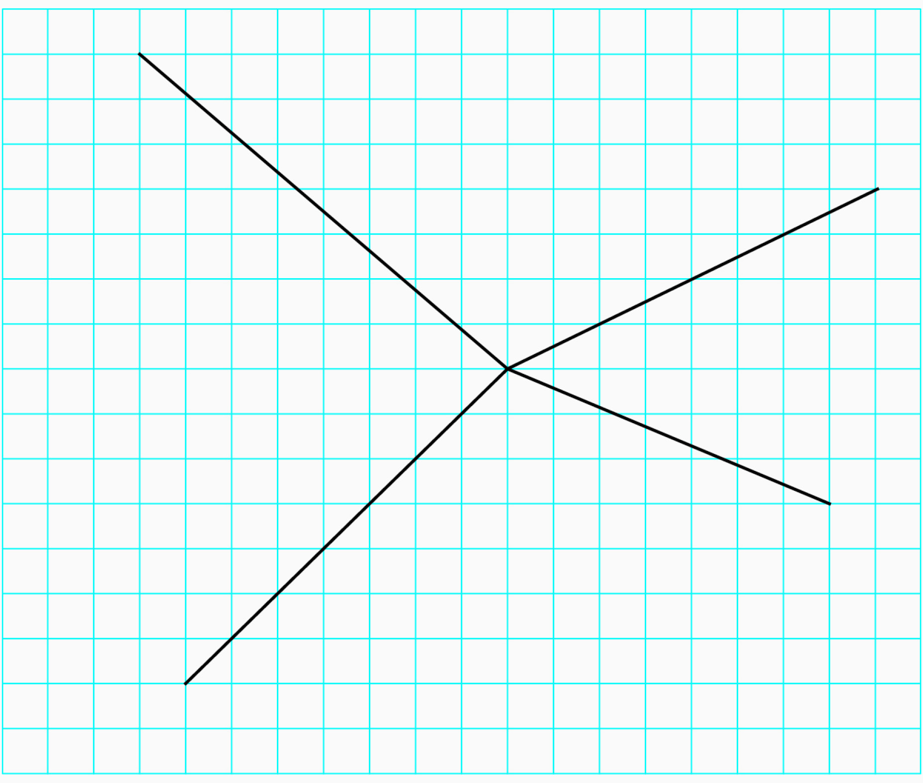
To provide structure around where and how the lines of intent are placed on any format, an underlying dot matrix grid has been developed. The facilitates purposeful placement of the brand device because the centre point and endpoints of each line should always sit on a dot of the grid.
Please note the dot matrix should not be visible on any final branded collateral. Instead, it is a foundational tool to help structure design layouts.
Dot matrix grid styles
There is a wide range of digital and print templates ready for use. These have been created with the optimal space between dots of the dot matrix. There will, however, be instances where additional templates need to be created, depending on format or brief.
We use two types of dot matrix grid formats, depending on the collateral size and format. For smaller digital and print formats, the dot matrix grid is built without columns. For medium and large digital and print formats, we create a dot matrix grid that aligns with an underlying column grid for text boxes.
Dot matrix for medium and large format layouts
Here you can find step-by-step guides for setting up a simple dot matrix grid. It’s important they are followed closely to ensure a level of consistency exists across the entire brand. The steps shown here may have to be slightly adapted depending on the shape of the format you are working on, but the fundamental direction will remain the same. This process applies to formats created in InDesign, so the process will differ in other applications.
There is no definite rule on how many dots should be used to create a dot matrix. However, it’s important not to flood the grid with dots. If there are too many dots to apply the lines of intent to, then the positioning of the device becomes arbitrary. Please refer to existing templates as a guide when creating collateral. A variety of sizes exist to help which can provide a sense of size and spacing for the dot matrix.
Dot matrix grid creation (step by step)
Step 1
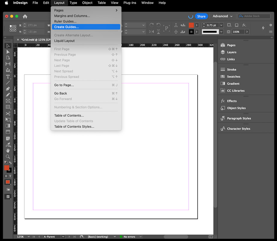
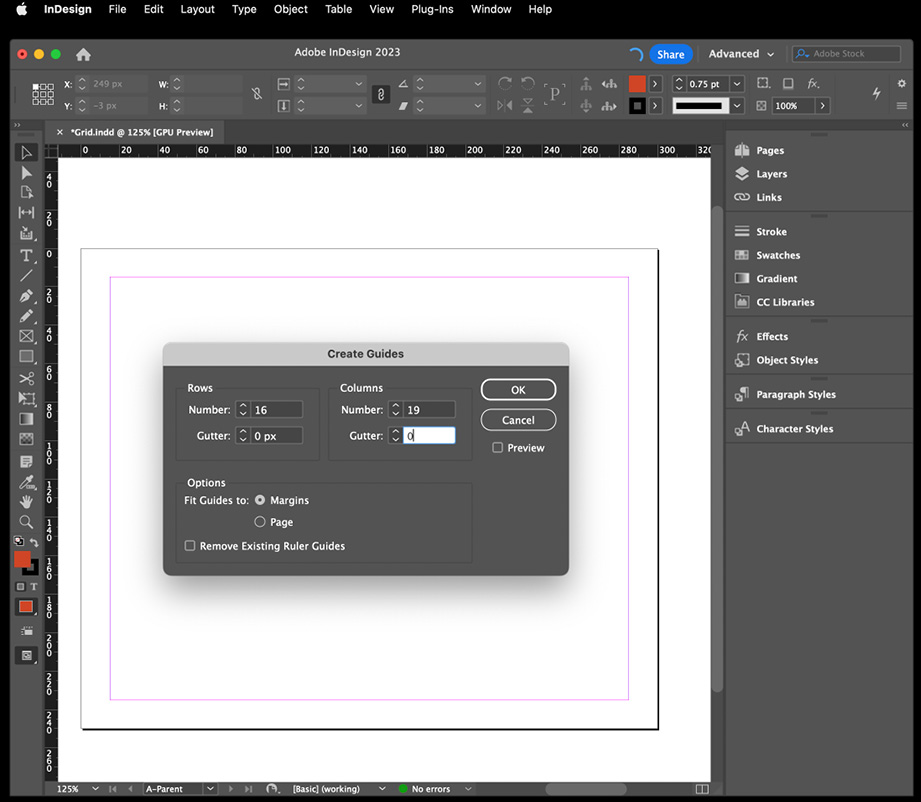
In the format you’re working in, select Layout > Create Guides
Step 2
Create as many rows and columns as suits the size and orientation of the format.* Ensure that Gutter is 0mm and the Fit Guides to Margins
button is selected.
Step 3
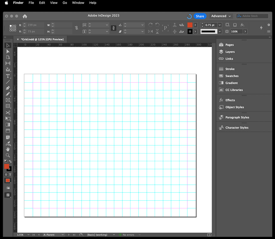
This will create the a criss-crossing of guides. Draw a circle to size that suits the format and place in the top left corner, centred on the vertical/horizontal/margin guides.
Step 4
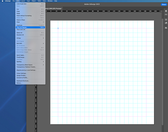
Select the circle and then select Edit > Step and Repeat
Step 5
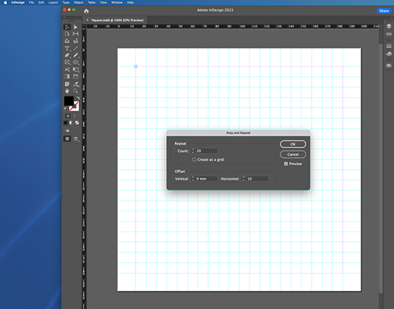
For the count, enter in the number of circles you want which will be the same as the number of horizontal lines. Enter a horizontal number to offset the circles within the format.
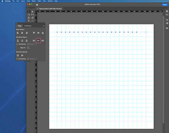
Step 6
The circles will be distributed. Select the one on the right and move it to align in the top right corner and click Distribute Horizontal Centres to space them evenly.
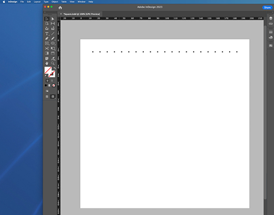
Step 7
When the circles are evenly distributed, select all and group them.
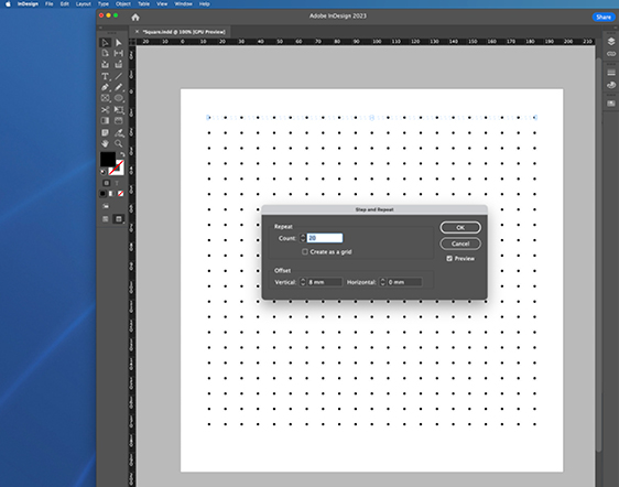
Step 8
Return to Step and Repeat, enter the counter number and a vertical number to offset them by.
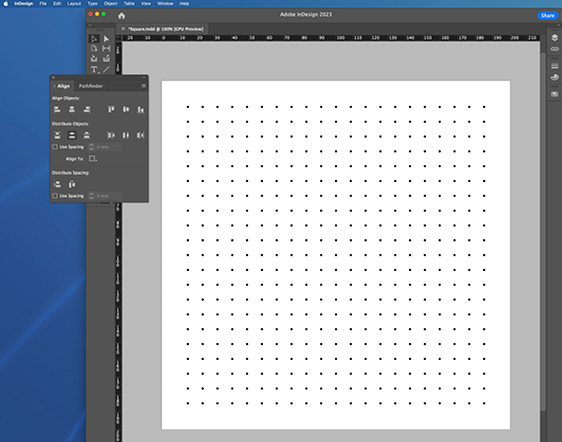
Step 9
Move the bottom line of circles to align along the bottom of the format, select all the lines and click Distribute Vertical Centres to space them evenly. You have a finished Dot Matrix.
Dot matrix small format layouts
This section outlines examples of small digital set formats where a gutter isn’t required, because a limited amount of text can fit on these formats. Larger digital presentation sizes such as our 1920 x 1080px template do use gutters. Small print formats such as A6 and DL sizes and below do not use gutters.
It is recommended that A5 be the starting size point for gutters to be utilised. There is no definite rule around the threshold where gutters are or aren’t used in digital and print formats, so please use the templates created as a guide to what is deemed the best case scenario and make a design evaluation from that point.
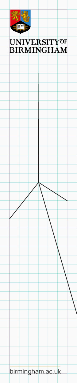
Skyscraper banner
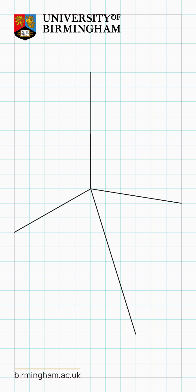
Double MPU
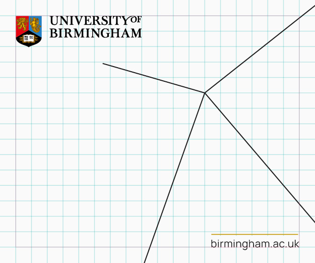
MPU
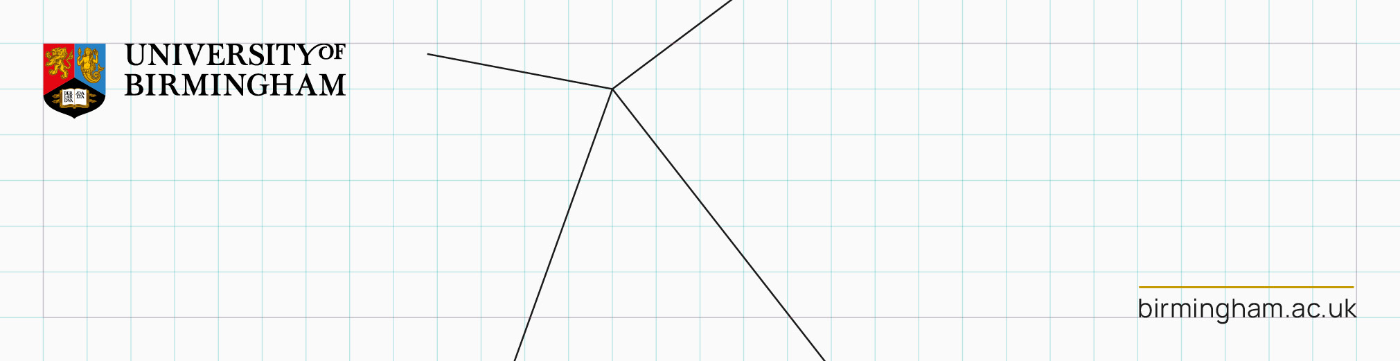
Billboard
Dot matrix small format layouts
When creating large document formats, where increased volumes of text or multiple images are required, it is important that we create a template that allows this to happen while keeping a solid structure in place. To do this, we create an underlying column grid that also aligns with the dot matrix grid.
This is a slightly more complicated process compared to the smaller format method and requires some trial and error and basic maths to get the best setup. It’s key to remember the number of columns and vertical ruler lines that have been applied to the format being created. A simple A4 format is being used in the example below to demonstrate the method, which can be adapted for different sizes of formats.
The step-by-step guide will give more detail, but as a basic summary, if you decide you want to use a 6 column grid for your bespoke format, then the amount of vertical ruler lines you add, must be perfectly divisible by 6. These lines must sit within the margins of the format and be equally distributed across the width of this area. The amount of vertical lines you choose will be an indicator of how wide you want your text columns to be. If you choose 48 ruler lines, this means 8 lines per column (6×8=48). You would then add another 6 vertical ruler lines to 48 for 54 lines, to give you the gutters that sit between your text columns.
If you find that the gutters are too big or too small, you will need to add or subtract vertical lines, to decrease or increase the column widths. If you want to decrease the column width, then add 6 (or any number equally divisible by 6) more vertical lines to make 54. If you want to increase the column width, then subtract 6 (or any number equally divisible by 6) vertical lines from 54 to make 48.
If you wanted to make a 7 column grid, the number of vertical lines needed would have to be perfectly divisible by 7 (42 for example) and you would need to add an another 7 lines for your gutters, giving a total of 49 vertical lines. If you wanted to make a 10 column grid, the number of vertical lines needed would have to be perfectly divisible by 10 (50 for example) and you would need to add an another 10 lines for your gutters, giving a total of 60 vertical lines.
Once you are happy with the visual spacing between the vertical ruler lines, add in your horizontal ruler lines. These too will have to sit within the margins of the template. Use the Step and Repeat function (Option+Command+U) to create the amount of lines you think is correct. There is no set number for the amount of horizontal lines you use but we suggest that what ever number you use ends up forming roughly square shapes when they overlap with vertical ruler lines and not rectangles. Please refer to the visual examples given as to the correct ratio you are looking to achieve.
You are now able to add the dot matrix pattern to your template using the same process set out in the previous section.
Dot matrix small format layouts (step by step)
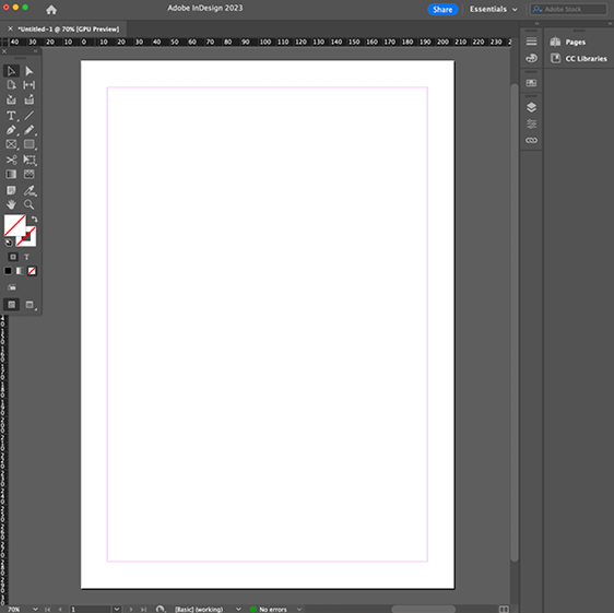
Step 1
Create your format in InDesign, setting your margins to the desired size.
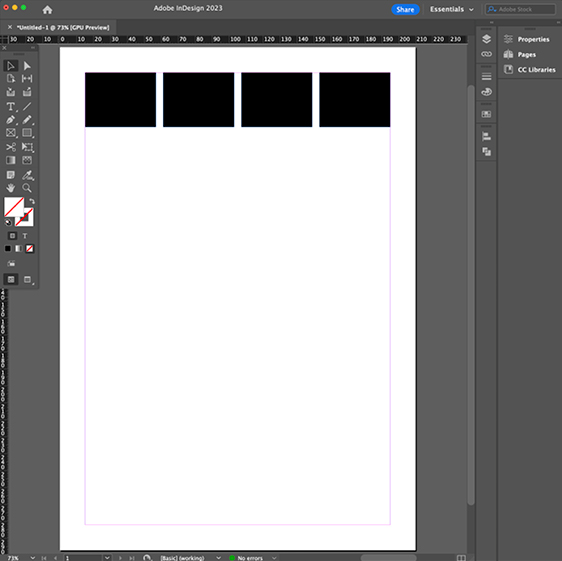
Step 2
Decide on how many columns you want your format to have and draw this amount of equal sized boxes that fit within the margins of the format, which will represent the column widths.
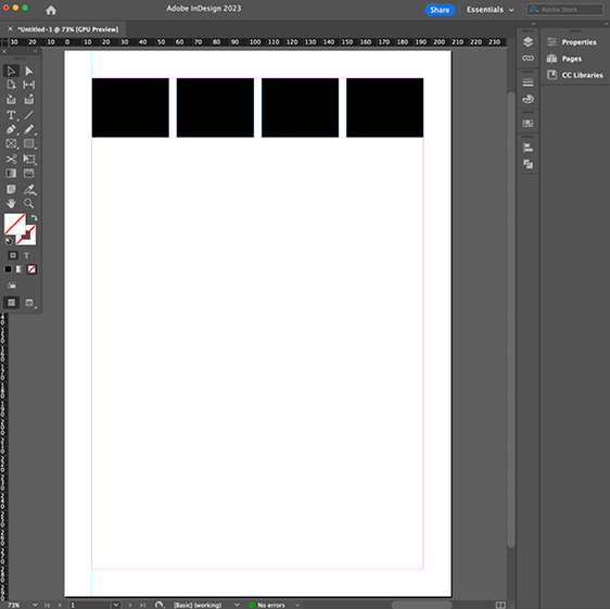
Step 3
Add in a ruler line on the left side of the format and align it with the outer edge of the margin. Decide how many ruler lines you want to have per column width. This number must be equally divisible by the amount of columns you have.
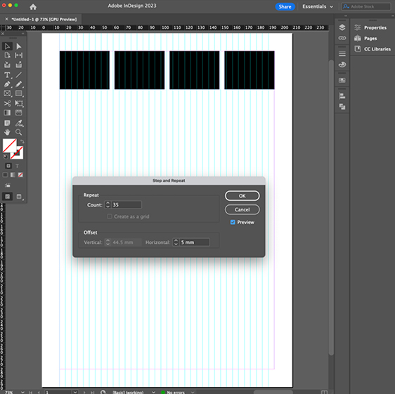
Step 4
Add extra lines equal to amount of columns you have, for the gutters. In this instance, we’re using 32 lines, split across 4 columns plus another 4 lines for the gutters, equaling 36 in total. Select the far left ruler line, press Command+Option +U, you can now add in the amount of lines you want repeated. The number count should be one less than the overall needed, as the ruler selected will be added.
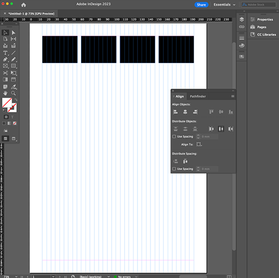
Step 5
Once all your vertical lines are in place, making sure they are all contained within the margins, align the far right one with the right hand margin and then click distribute horizontal centres in the align panel. This will distribute the vertical ruler lines equally within the margins.
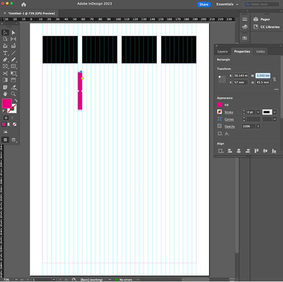
Step 6
Redraw your four boxes so they align equally with the vertical lines, with gaps left for the gutter. Draw a pink box in the gutter between the boxes and take a note of it’s width, as this will be the column width you will apply to your text box.
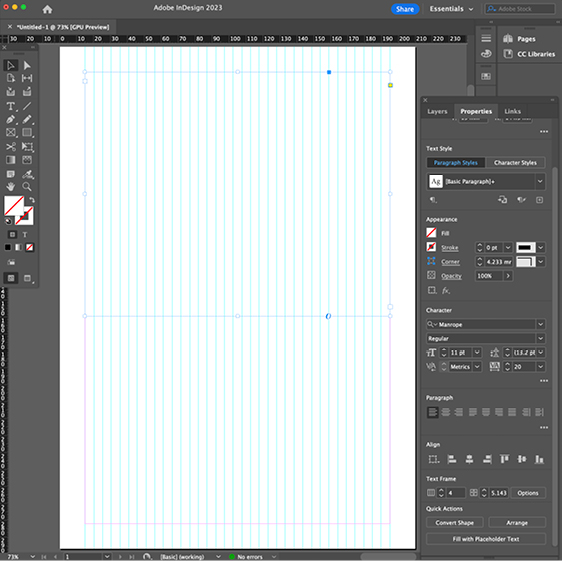
Step 7
Draw a text box between the widths of the margins and delete the boxes. Set the columns and gutter width (equal to the width of the pink box) and the text properties (set to text specifications as stated in Brand Portal) in the Properties panel.
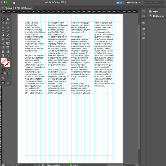
Step 8
Add text to your text box and it will equally spread out across the four columns, with the columns and gutters aligning to vertical lines underneath. You can now create your horizontal ruler lines.
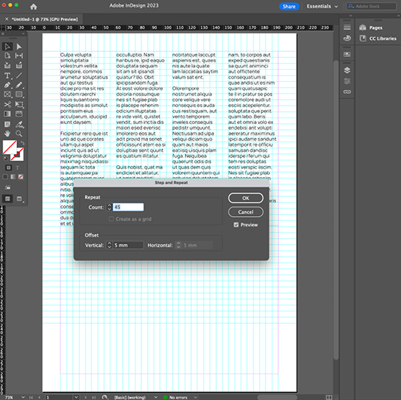
Step 9
Make your first horizontal line and align it with the top margin of the format. Select this ruler line, press Command+Option +U to add in the amount of horizontal ruler lines you want.
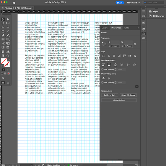
Step 10
Take the lowest of the horizontal lines and aligned if over the top of the bottom margin line. Select the rest of the ruler lines and then click distribute horizontal centres in the align panel. This will distribute the horizontal ruler lines equally within the margins.
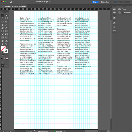
Step 11
There will be an element of trial an error with this stage of the process, to get a grid that doesn’t have too many lines. If there are too many lines, repeat some of the previous steps, until happy with how the grid looks, looking to achieve rough square shapes from the crossing vertical and horizontal lines.
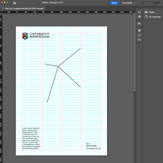
Step 12
Your grid will now be complete and you can start to add in other elements of the brand tool kit and edit your text, to build your communication pieces.
Lines of intent
Creating lines of intent
This section outlines the details on how to create the lines of intent when building a bespoke format. When creating your own lines of intent, please first reference the existing pre-set templates and source one which closely matches the dimensions of your new format. The pre-set templates have built-in stroke weights and can act as a guide for stroke point size and what should be used to draw the new required version of the lines of intent.
Creating lines of intent (step by step)
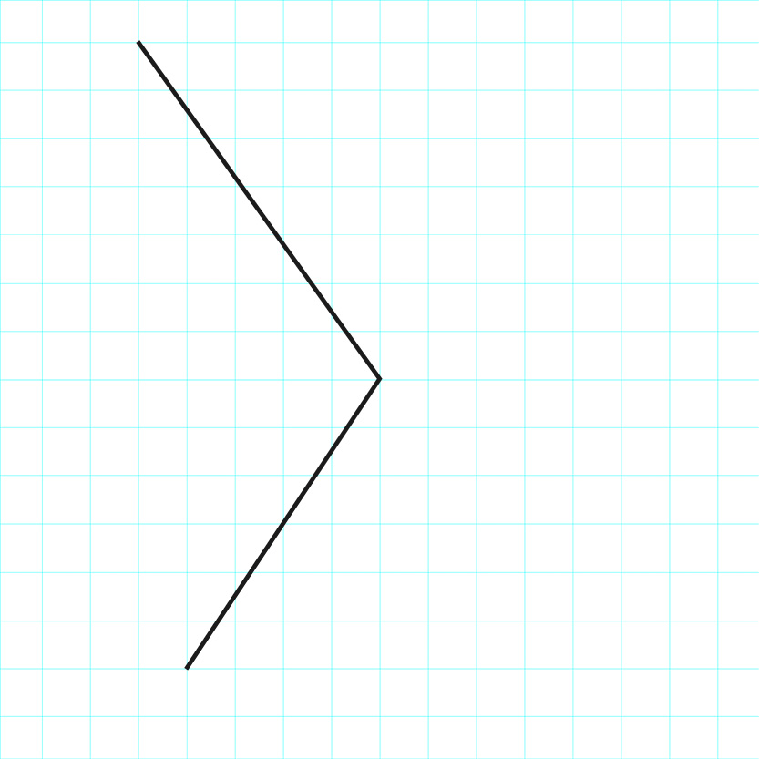
Step 1
Using InDesign, line like this is drawn. The Snap to Guides function is activated under the View > Grids and Guides control panel, so the pivot point will snap to the crossing point of the grid guides.
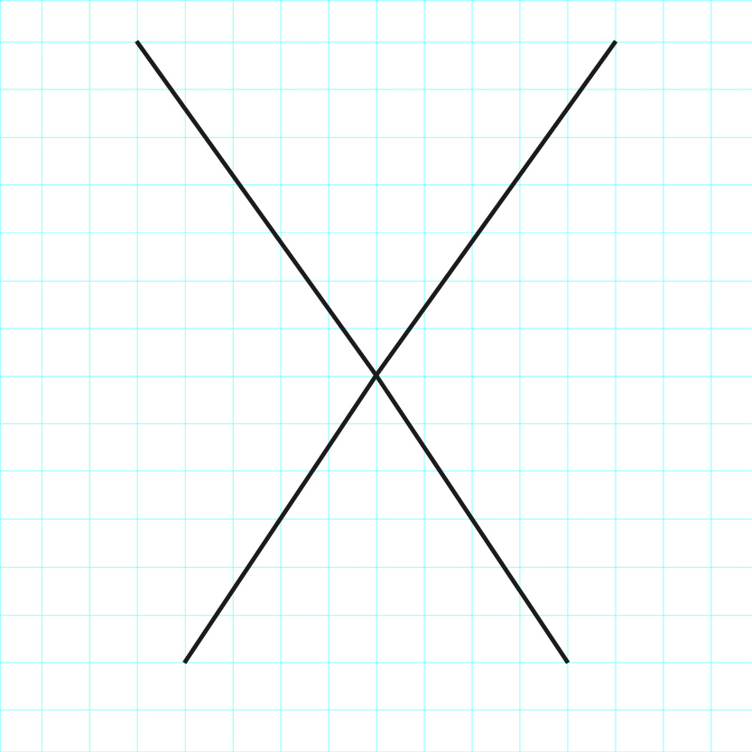
Step 2
The first line is copied, pasted and flipped horizontally, with the pivot point snapping to the same crossing point of the grid guides as the first line.
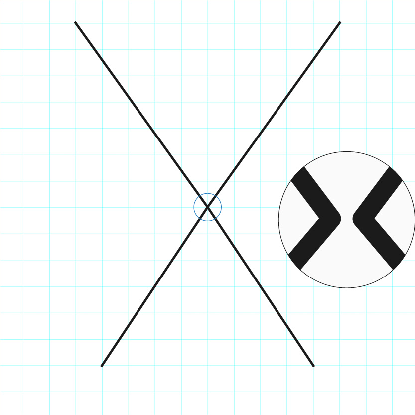
Step 3
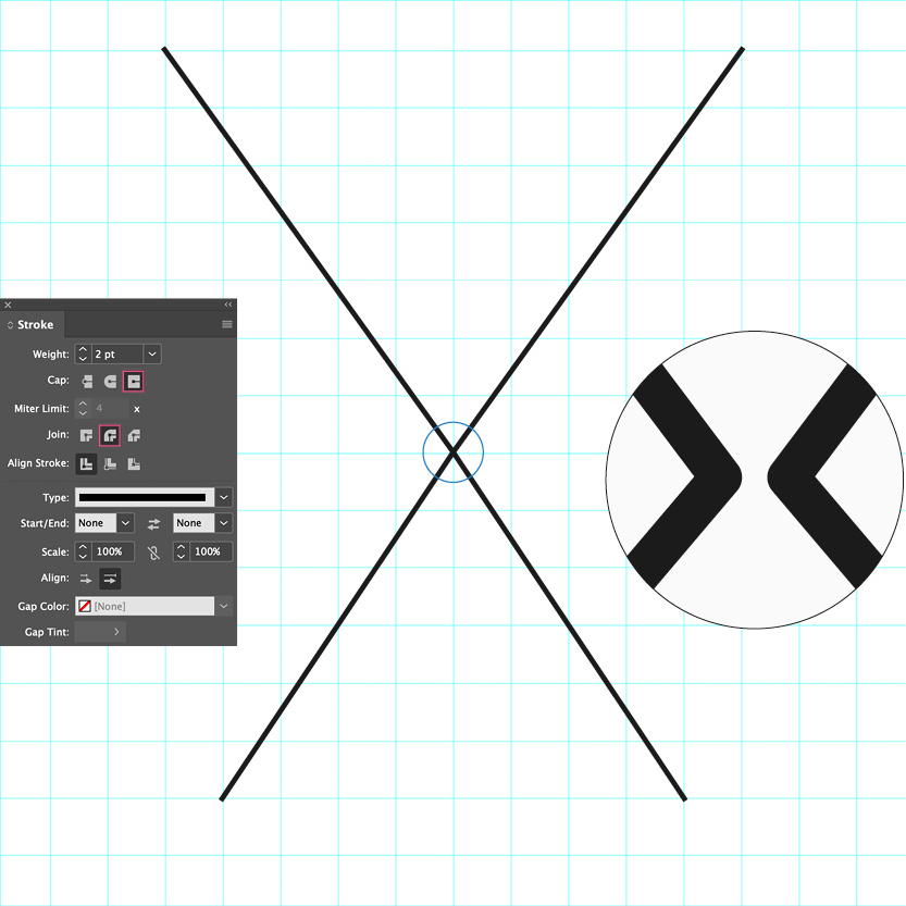
With the Direct Selection tool, the two middle points are selected and in the Stroke Terminal (shown here) the Projecting Cap Ends and Round Join are selected. In the close up diagram, you can see how the joins are rounded. This done to ensure that when the Lines of Intent start being shifted to more acute angles, the joins don’t create uncomfortable shapes, that break from this join.
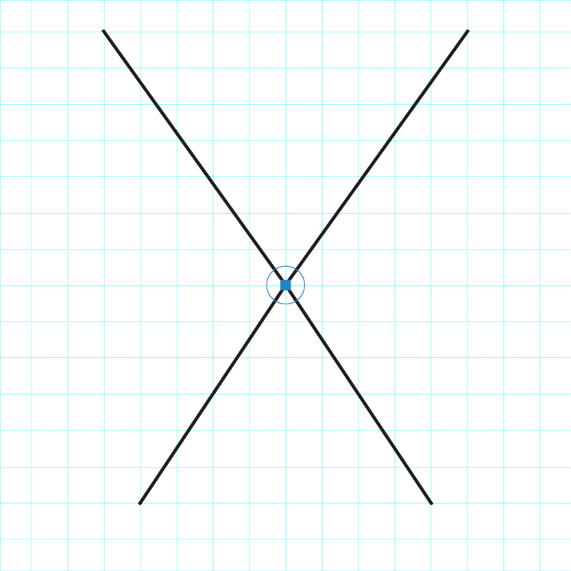
Step 4
Using the Direct Selection tool, the two middle points of the Lines of Intent can be selected and these points can freely moved around the format and set on a crossing point of the grid.
Step 5
Once the pivot section of the Lines of Intent set correctly, use the Direct Selection tool to individually select the cap ends of each line and move that section of the line in the direction you want.
Step 6
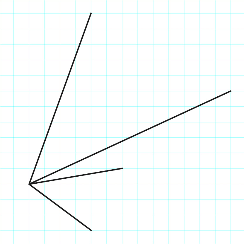
Endless shapes and layouts can be created using the Lines of Intent.
Two colour lines of intent
In the ‘Brand in Action’ section of the portal, you will see examples where the lines of the brand device utilise both black and white, when it crosses over a dark/black area to a light/white area of a layout. To replicate this look, please ensure that a line doesn’t change colour more than once. Please also ensure the lines of intent retain visual strength and don’t overly complicate or distract within a design layout. If in doubt, please use the ‘less is more’ philosophy.
The examples here are to provide insight into the thought process used to achieve the most striking result.
Simple black and white crossover
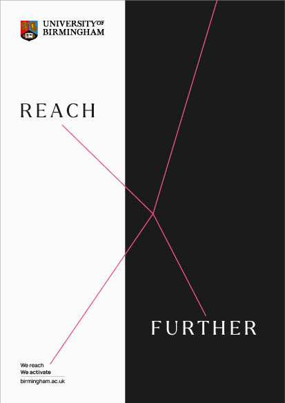
When creating simple designs where the lines of intent shift from black to white, firstly set them in a bright colour.
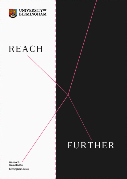
Ensure that the white and black are their own separate solid colour boxes, as indicated here with dashed line and then copy and paste the lines of intent into both.
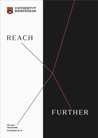
Select the lines of intent in the white box and change to black.
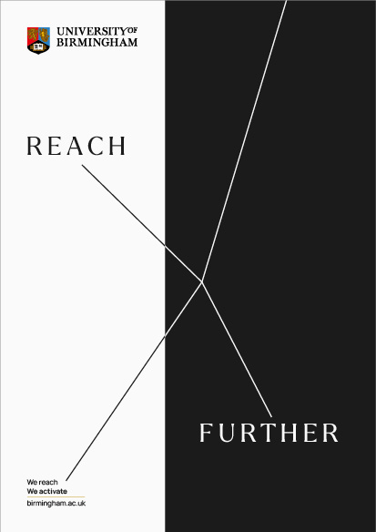
Select the lines of intent in the black box and change to white and you will create a seamless transition from black to white on the spokes of the lines of intent.
Complex black and white crossover
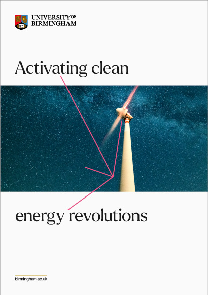
This example is more complex than Example 1 as the lines of intent sit across an image and pass into white areas above and below the image. The lines have been set to best suit the design layout.
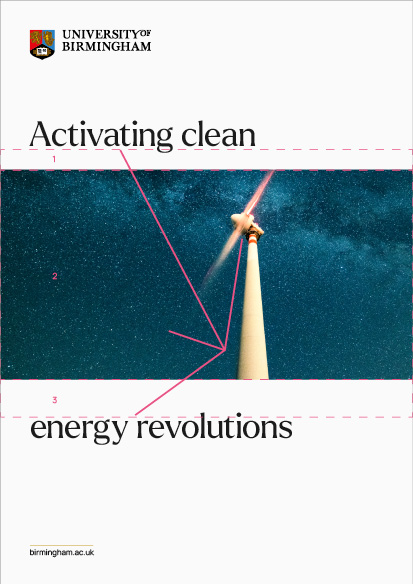
Three image boxes have been created as indicated here with dashed lines and numbered 1 to 3. These are so the lines of intent can be copied into each box in the different sections of the design.
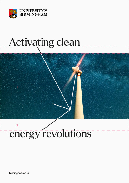
The lines of intent are copied into box 2 and the colour changed to white.
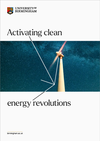
The colours of the lines of intent in boxes 1 and 3 are then changed to black, so they contrast with the white background.
Colour crossover on containers
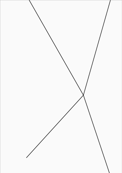
On this example, the lines of intent are acting as a container while also sitting on top of a block image.
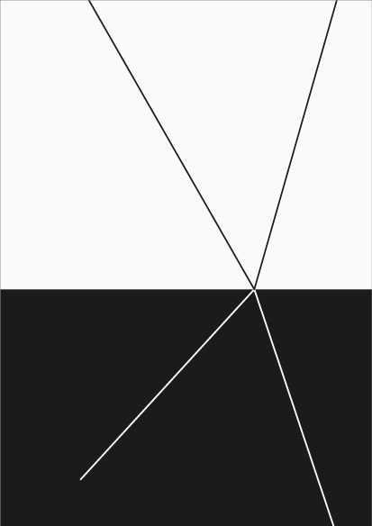
In this simplifed version of the design, the top lines sit in black and the bottom lines sit in white.
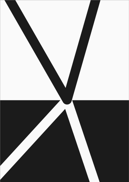
This zoomed in visual shows the overlay of the spokes and how they meet at a central point.

The final design shows how the lines of intent colours work as a key part of the design layout.
Inverted line colour
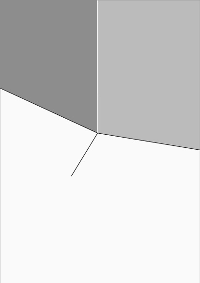
With this example, one of the spokes inverts back into the container, running over the image.
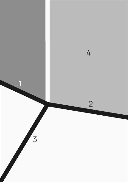
The zoomed-in visual shows how spokes 1 and 2 are connected as one stroke. Spokes 3 and 4 are separate strokes. Spoke 4 which is set in white and sits beneath the central join of spokes 1, 2 and 3.
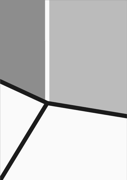
When using the spoke like this the white spoke must sit under the three black strokes so there’s no awkward overlay with the white spoke being on top.

The final design, shows how spoke 4 of the lines of intent follows the angle of the shape and contrasts with the image.
Brand in Action
Lines of intent usage for containers
When using the lines of intent as containers for imagery or text to sit in, there are different ways that they can be utilised. In all cases, it’s important to remember that where the spokes of the lines of intent meet, they use the ‘Round Join’ to ensure that the points where the spoke meet are seamless, as seen in the ‘Creating Lines of Intent’ section.
Open all
Block colour
+ -When the lines of intent expand out to make a block colour for text to sit on, the two edges of the block of colour represent the two other spokes of the lines of intent. These edges of the block colour can remain in the same colour as the block. The other two spokes of the lines of intent should be visible.
Holding images
+ -When the lines of intent expand out to make a containers for images to sit in, the spokes should be set in a colour which best contrasts with the background. In the example given it is black. However, depending on your design, these maybe black and white, as seen in the ‘Two Colour Lines of Intent’ section.
Full bleed and refracted imagery
+ -When all four spokes of the lines of intent bleed off a format, the two containers created leads to another two made from the counterspace. These four containers can be used to fill with imagery or solid colour. This will effect the colours that you make your lines of intent. This could be a mix of black and white or a single colour. Please ensure that the lines of intent are clearly defined against the imagery. There maybe light or dark parts of an image that leads spokes to be slightly less defined. This is fine as long as the overall shape that the lines of intent make is clear.

Block colour

Holding images

Full bleed and refracted imagery
Using our brand
The brand system has been developed to enable dynamic and flexible layouts. The range of visual styles that can be achieved with the lines of intent will ensure brand communications remain contemporary yet consistent.
When working with the lines of intent, please carefully consider the content and context of what you are designing and who are you designing for. The lines of intent brand device has been created to interact with other elements within a layout. Consider the angles, shapes and objects within an image and how the lines of intent could interact with, frame, mimic or align. The lines of intent can also point to or interact with typography.
The lines of intent do not need to appear on every single piece of brand collateral. Instead, other elements from the toolkit can be used on their own. Generally, only one brand device should be used per format, however this is open for interpretation when special cases arise.
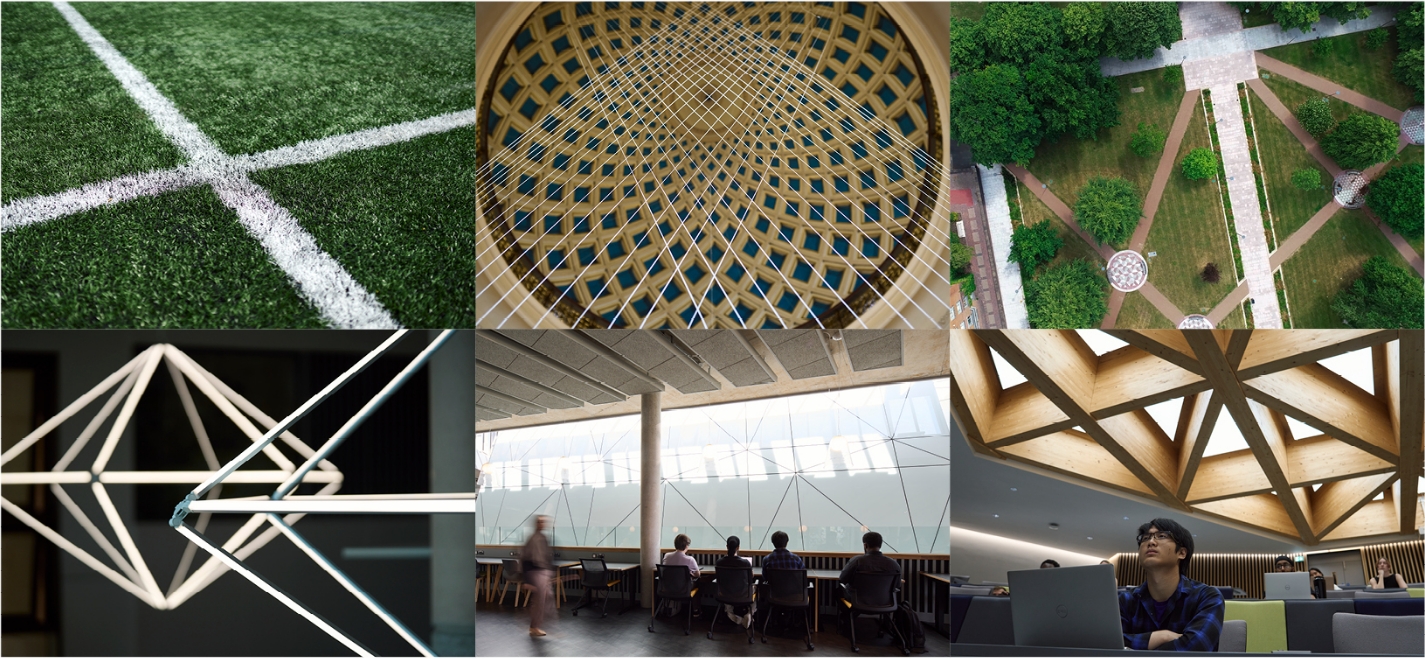
There are instances where the lines of intent can be represented through our imagery. For example, architectural lines/detailing or light and shadows can act as visually compelling ‘natural’ lines of intent.
Whilst there are no set rules around exact lengths of each line, the central point and endpoints should ideally sit on a dot within the underlying dot matrix grid. However, there will be instances where this is not always possible, and so design discretion should be used.
The stroke thickness of our lines of intent has been pre-set in the templates and should be adhered to as closely as possible. There may be occasions where alterations to thickness are required. In these special case instances, please consult with the Brand Team for further direction.
Contemporary usage for the lines of intent
When designing for our University, please think about how our brand system can be used to create contemporary layouts. Consider the use of white space, placement of typography, image cropping and placement and how the lines of intent brand device is carefully placed and positioned. Approaching each layout with this careful consideration of each element will ensure our brand collateral feels relevant and modern.
The examples shown here introduce some of this thinking, while also showing how any number of the spokes from the lines of intent can remain on the format, depending on what works best for that particular design.
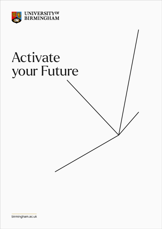
All spokes of the lines of intent on the format, white space utilised, large typographic message.

Full bleed image, lines of intent framing key part of the image, logo, headline and CTA connected by the lines of intent.
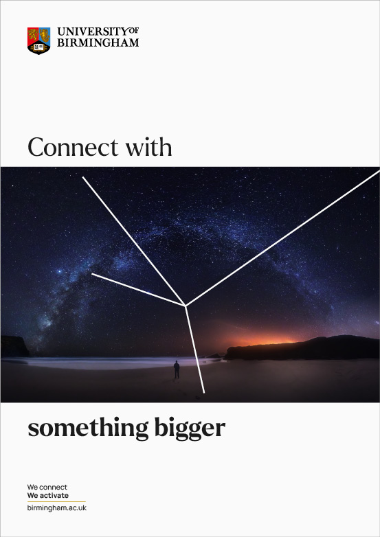
Minimalist design layout, one spoke bleeding off, lines of intent mimicking a star constellation, while also connecting the headline text.

Two spoke bleeding off the format, headline set against the lines of intent, contemporary use of image, lines of intent interacting with the image and changing colour to white on a darker background.

Three spokes bleed off the format, which mimic the body shape of the subject, full bleed imagery makes for a high impact design piece.

The introduction of a border adds a contemporary feel to the design, with all four spokes bleeding off while mimicking key angles of the image and the headline text is split across the format.
Point of focus
Finding a point of focus within an image and positioning the lines of intent in ways that align or interact will bring this system to life. The lines of intent can sit simply over an image or can become more interactive and playful, if appropriate.

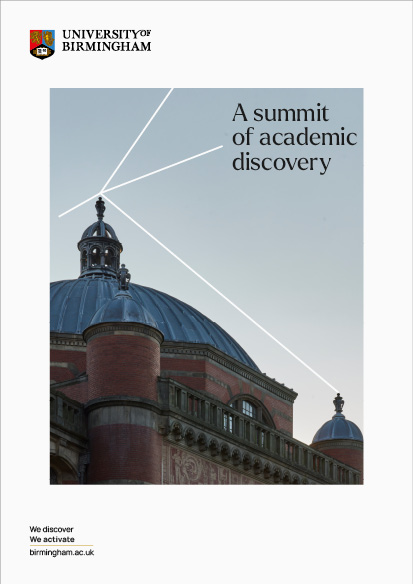


Align with angles
The brand device aligns with naturally occurring lines, shapes or angles within imagery or blocks of text. If a line crosses over light to dark background areas, it can change from dark to light for legibility.
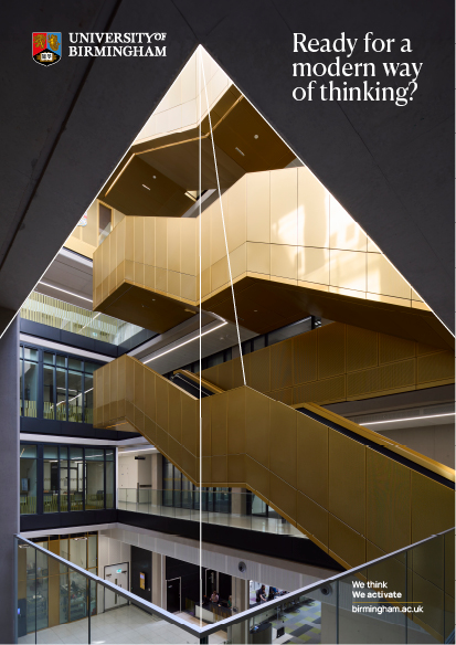



Container
The lines of intent can interact with imagery in many different ways to give the impression of existence within a 3D space. The lines can cut in front of or go behind key elements of an image. Lines can also cut behind image containers. This flexibility facilitates interesting perspectives.
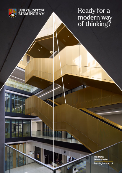



Refract imagery
The lines of intent can be positioned to refract imagery by cutting through a format at acute and obtuse angles. This allows imagery to be offset at different sizes and scales, which result in rich, dynamic visual layouts. Careful consideration should be given when selecting imagery so that refraction strengthens the overall visual concept as opposed to complicating or distracting from the message.



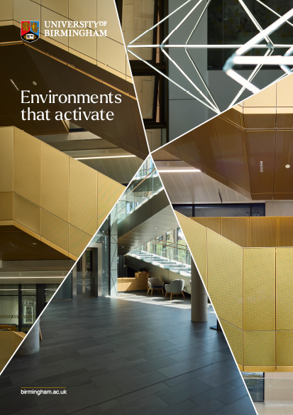
Split line
The lines of intent can be broken by text or an object within an image. It can cut in front and behind the contents of an image, while also sitting in front and behind image containers. The line can also be broken by text or an object in an image and doesn’t have to always appear to be running directly behind a subject.

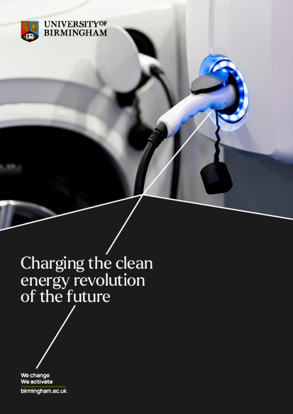

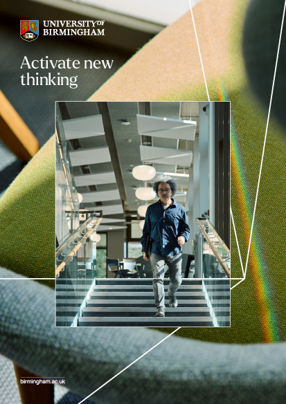
Naturally occurring lines of intent in photography
The structural nature of the lines of intent means you will be able to find natural instances in the built world where these lines are present. Using the lines of intent in this way demonstrates an understated confidence in our creative decision making. Please refer to examples below for inspiration.
Special cases for brand system
When designing for any brand, special case scenarios will arise where the set guidance that applies for everyday use must be adapted in order to come to the best design solution. This requires making good design judgement to ensure the overall essence of the brand is held brand remains intact.
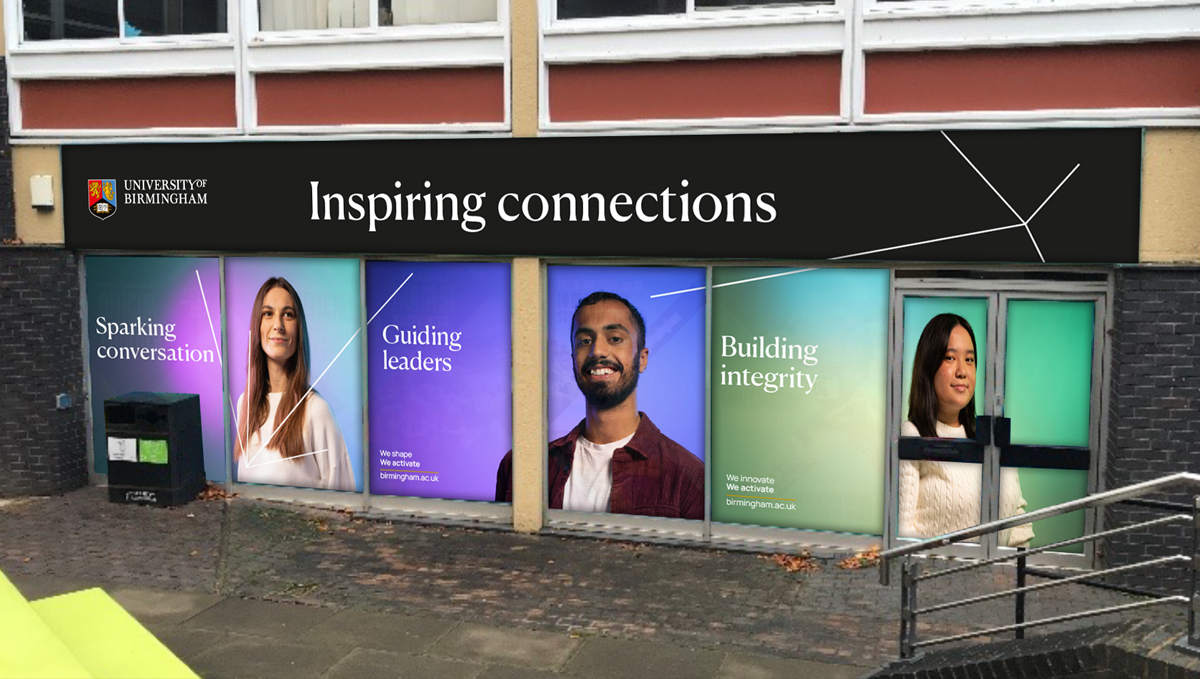
As previously stated in the ‘Using Our Brand’ section of the portal, the lines of intent brand device does not need to be utilised on every single piece of collateral, where other parts of the toolkit may be more appropriate. On the first example shown below, you can see how the elements of the brand toolkit are split across a group of three flags. This decision was made because of a) limited space on each flag and b) the close proximity of the flags with one another.
On the second example below, the format is split across multiple window panes. Adding an additional set of lines of intent helps create an overall dynamic feel across this expansive area.
Special case scenarios should happen only when absolutely necessary and other solutions do not result in the same visual strength. Please speak to the Brand Team for further guidance.

Incorrect design layouts
Our flexible brand system facilitates endless creativity. With the ability to design so freely, there is also potential for the system to be misused, resulting in inconsistency and dilution of the brand identity. Familiarise yourself with these guides and use your creative instinct to create on-brand collateral. Some sample incorrect executions are shown below.
– Poorly placed lines of intent
– Illegible text placement
– Awkward image crops
– Lines of intent that are too thick/thin
– Misuse of colour

Create lines of intent that have no meaning

Create awkward angles and shapes

Compromise text accessibility on backgrounds

Use more than one set of lines of intent on a standard format

Crop images badly

Create lines of intent that are too thick or thin
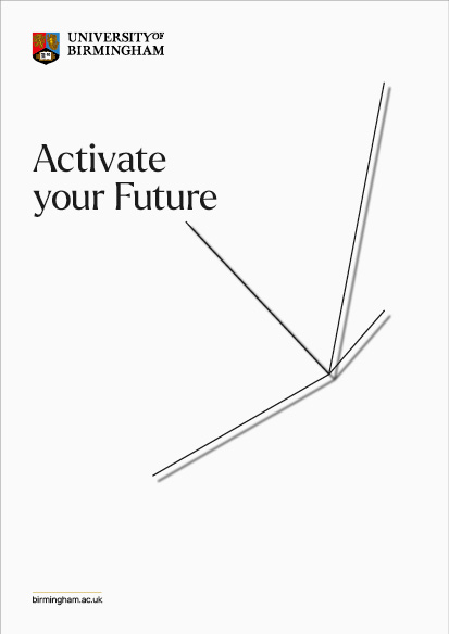
Use a drop shadow on the lines of intent
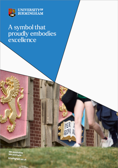
Use secondary colours for the lines of intent