Logo
This is the primary logo for University of Birmingham and plays a fundamental role in establishing our brand presence, both nationally and internationally.
Our logo is made up of two core elements; the University of Birmingham crest and wordmark. Together these elements become the University of Birmingham logo. The crest and wordmark lockup should never be separated.
Our logo also exists as a stacked version for maintaining legibility at different format sizes and layouts.
When creating new brand communications, please download and use the newly updated logos in our suite. Do not use older versions of the logo that you may have saved from previous designs.
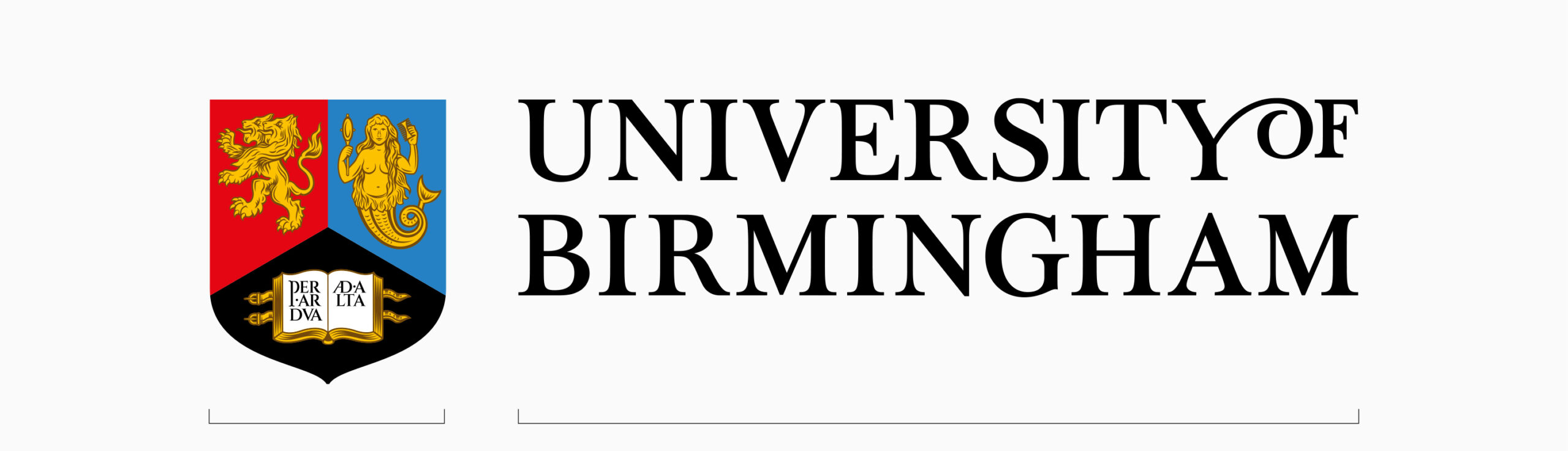
- Crest
- Wordmark
Primary logo
Our primary logo is the landscape version and is fundamental to our brand communications. This version of the logo should be used on the majority of applications. It also exists in positive, negative and monochrome formats to work best on different backgrounds, fulfil different needs and maintain a strong visual presence for our brand.
Open all
Positive
+ -This version of the logo should be used on white or light coloured backgrounds.
Negative
+ -To keep our logos accessible and visible, this version is an alternative for when the logo needs to sit on a solid black or darker backgrounds such as on imagery. The white stroke around the crest and the white wordmark makes this achievable. Using the primary positive logo would be less legible on such background because of the black wordmark and black section of the crest.
Black and white mono
+ -Our black and white logos are used in exceptional circumstances for mono applications only, e.g. on third party applications where logos appear in black and white or where colour reproduction isn’t possible. If unsure about when to use, please contact the University’s Brand Team.
Positive logo
Negative logo

Mono white logo
Mono black logo
Our logos are available in CMYK and RGB in the following formats:
- AI
- JPG
- PNG
- SVG
Primary logo: stacked
A secondary version of the logo is the stacked orientation, for use when space within a format is more limited. Examples of this include skycraper banners and pull-up stands.
Open all
Positive
+ -This version of the logo should be used on white or light coloured backgrounds.
Negative
+ -This version is an alternative for when the logo needs to be reversed out of darker backgrounds. The white stroke around the crest and the white wordmark makes this achievable.
Black and white mono
+ -Our black and white logos are used in exceptional circumstances for mono applications only, such as on third party applications where logos appear in black and white or where colour reproduction isn’t possible. If unsure about when to use, please contact the University’s Brand Team.
Positive logo
Negative logo
Mono white logo
Mono black logo
Our logos are available in CMYK and RGB in the following formats:
- AI
- JPG
- PNG
- SVG
Crest
There are rare occasions where it is necessary to use only the crest from the University of Birmingham identity. This may include social media avatars, or built environment pieces where space is limited and the wordmark doesn’t fit. Please seek approval from the Brand Team before any production begins.
Open all
Positive
+ -This version of the logo should be used on white or light coloured backgrounds.
Negative
+ -This version is an alternative for when the logo needs to be reversed out of darker backgrounds. The white stroke around the crest and the white wordmark makes this achievable.
Black and white mono
+ -Our black and white logos are used in exceptional circumstances for mono applications only, such as on third party applications where logos appear in black and white or where colour reproduction isn’t possible. If unsure about when to use, please contact the University’s Brand Team.
Positive crest
Negative crest
Mono white crest
Mono black crest
The download file below includes the following formats:
- AI
- JPG
- PNG
- SVG
Primary University logo - campuses
In order to recognise the importance of our global campuses, these logos will include the name of the campus location. Where appropriate the name of the campus location can appear in the local language – as in the case of Dubai.
Conditions of use:
- In all communications, both printed and digital where they represent a University campus, such as in Dubai.
- To be applied to both internal and external audiences
- Must always be used in adherence with the University’s brand guidelines.
- Cannot be used with any other logo, internal or external without prior approval.
Logos for the Dubai campus are available in CMYK and RGB in the following formats:
- AI
- JPG
- PNG
- SVG
Logos for the Dubai campus are available in CMYK and RGB in the following formats:
- AI
- JPG
- PNG
- SVG
Secondary logos
Where individual Colleges or Professional Services Divisions are communicating, a Secondary University logo can be used. This is a formal combination of the University logo with an individual official unit’s name. This helps to identify the origin of local communications whilst also demonstrating a strong belonging to the University.
Criteria for using the Secondary University logo:
- An area that forms part of University’s organisational structure such as a College, School, Professional Services Division, or wholly owned subsidiaries.
- All research centres / institutes except those that are classified as a ‘Major Nationally Recognised Research Centre’ (see exceptions).

University of Birmingham College of Arts and Law logo
University of Birmingham College of Arts and Law logo
Exceptions:
Major nationally recognised research centres
Aligned with the reclassification of all research centres and institutes across the University, only those research centres classified as a ‘Major Nationally Recognised Research Centre’ or ‘University Research Institute’ are permitted to have a graphical device, along with the typographical logo.
Those research centres and institutes that not classified as such adopt the Secondary University Logo.
Criteria for using this:
- Formally classified as a ‘major nationally recognised research centre’ or ‘University Research Institute’
- Graphical device must be in mono and text in manrope.
- The name of the centre / institute must be written out and not abbreviated.
- Where existing graphical devices exist, these may need to be redrawn.
Birmingham Institute for Sustainability and Climate Action landscape
Birmingham Institute for Sustainability and Climate Action stacked
Cultural destinations
Cultural assets that operate as a visitor destination and that need to compete with other cultural attractions are permitted to use a graphical device in combination with a typographical logo.
Criteria for using this:
- Graphical device must be in mono and text in manrope.
- The University Logo and Crest should always appear at the top when logos are stacked.
University of Birmingham Lapworth Museum of Geology logo
University of Birmingham Lapworth Museum of Geology logo stacked
Co-branding: equal or significant partner
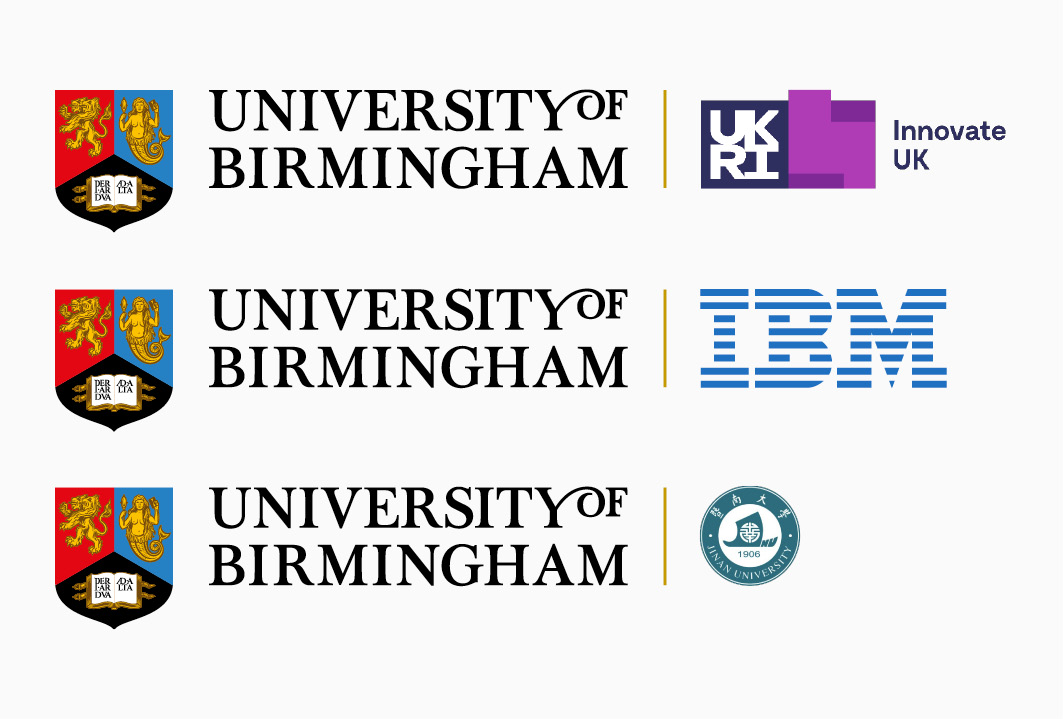
When the University is an equal or significant partner in a partnership, collaboration the partner logo may be used in lock up with the University logo. This is generally on occasions where it is deemed to be reputationally advantageous and signals a strong strategic relationship.
Criteria for using this:
- A partner should only use the University logo if a formal partnership agreement, sponsorship agreement, Memorandum of Understanding, or equivalent formal agreement exists.
Co-branding: multiple partners
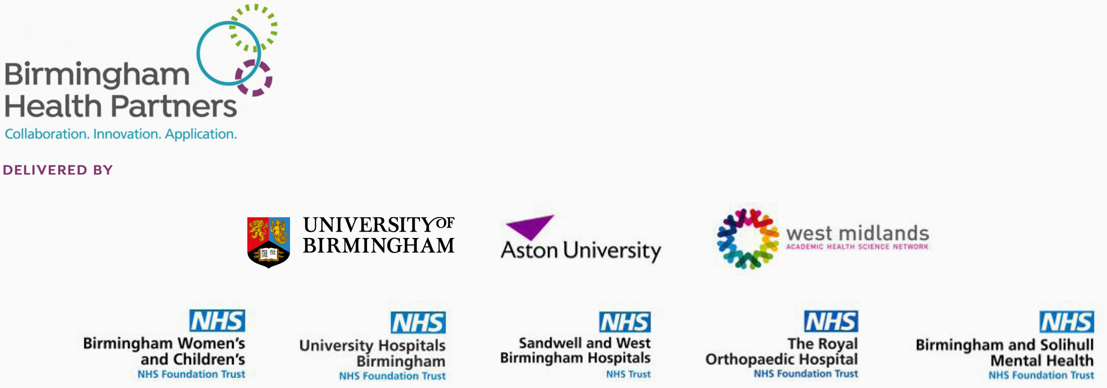
When multiple partners come together to form an organisation, it is permitted to create a unique logo and identity that is separate to the Primary University logo.
In the instance of multiple partners, all their logos should be included on any collateral, with logos placed left to right with the University of Birmingham logo always placed first whenever possible. Space between logos is as indicated, logos are to be sized to create equality to all partner organisations. The gold line is not required.
Within some partnerships, it can be helpful to clarify the relationship between the two partners, and in this case the gold separation line is not used.
Criteria for using this:
- Where the University of Birmingham is a lead partner in a consortium, it should be placed on the left.

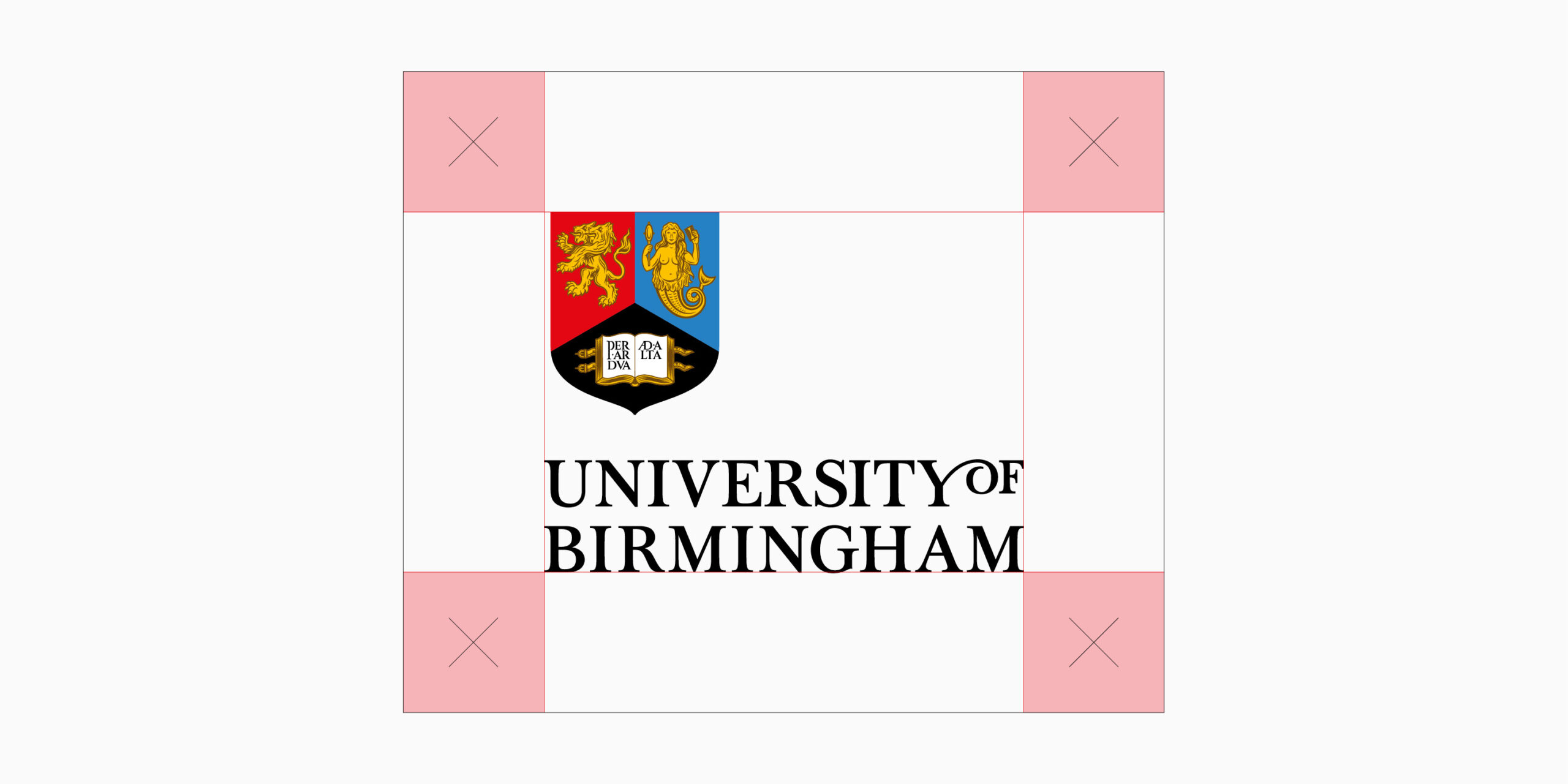
Minimum clear space
Primary logo
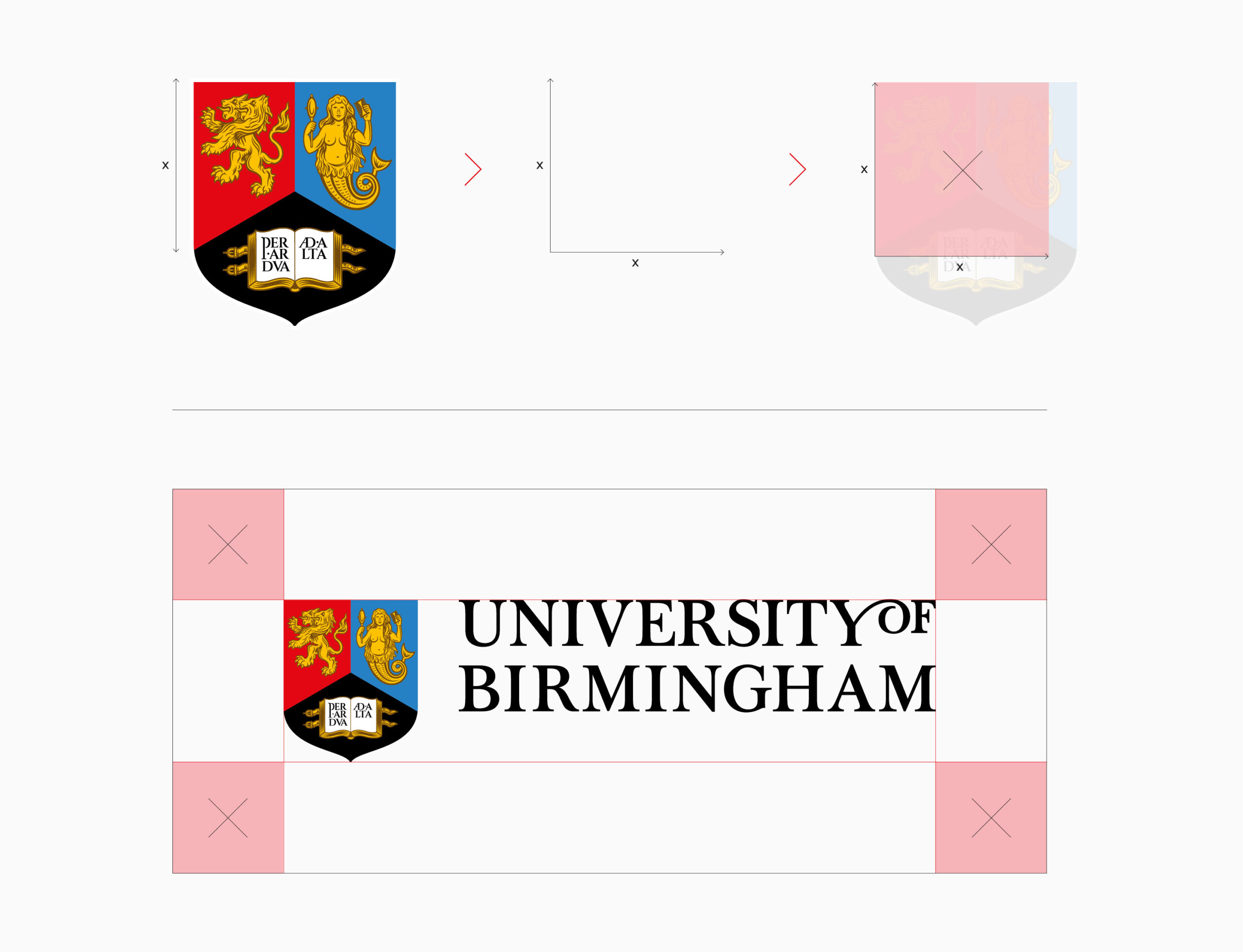
To protect the clarity and visual integrity of our logo, it must always appear with a minimum clear space around it. No other graphic elements should encroach in this area. When placing the logo on a full colour image, ensure that a high degree of contrast exists between the logo and image, so that the clarity and legibility of the logo isn’t reduced.
The sizing formula for how this space is calculated can be seen below and equates to a square based on the height of the red section of the crest.
There may be some cases where this rule can’t be applied because of limited room on a format. If this happens, please refer to the University’s Brand Team, so a best case scenario can be decided on.
Primary logo: stacked
The rule and formula that applies for clear spacing around the Primary landscape logo, also applies for the primary stacked logo.
There may be some cases where this rule can’t be applied because of limited room on a format. If this happens, please refer to the Brand Team, so a best case scenario can be decided on.
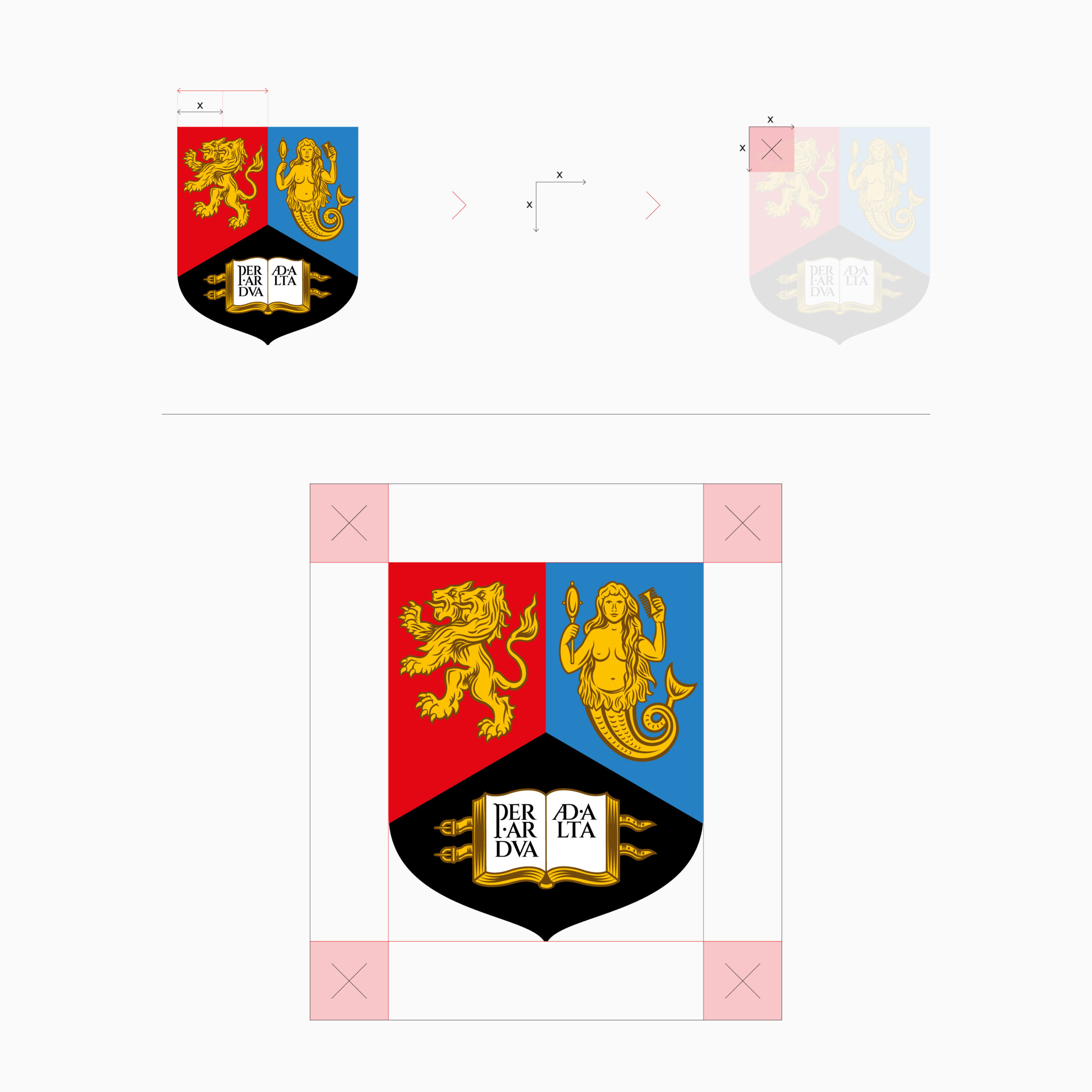
Crest
If you are using the crest as a sole graphic, a different rule applies to the minimum amount of clear space around it. No other graphic elements should encroach in this area.
The sizing formula for how this space is calculated can be seen below and equates to a square based on half the width of the red section of the crest.
There may be some cases where this rule can’t be applied because of limited room on a format. If this happens, please refer to the Brand Team, so a best case scenario can be decided on.
Primary logos minimum sizes
To maintain the clarity of our logo, we have created set logo sizes within each of the templates. With there being an infinite amount of format sizes that can be created, we’ve set out some very general rules around minimum logo sizing. When you are creating communications, please refer to exisiting templates to give direction on what the logo size should be. If the design piece you are creating falls outside of the templates, refer to the template closest in size.
The sizes shown here for the primary versions of the logo and the crest, apply to all colour variations within each of these. If the logo is appearing on printed merchandise where the printing area is smaller than the minimum size shown here, it should be made as big as possible within that area.
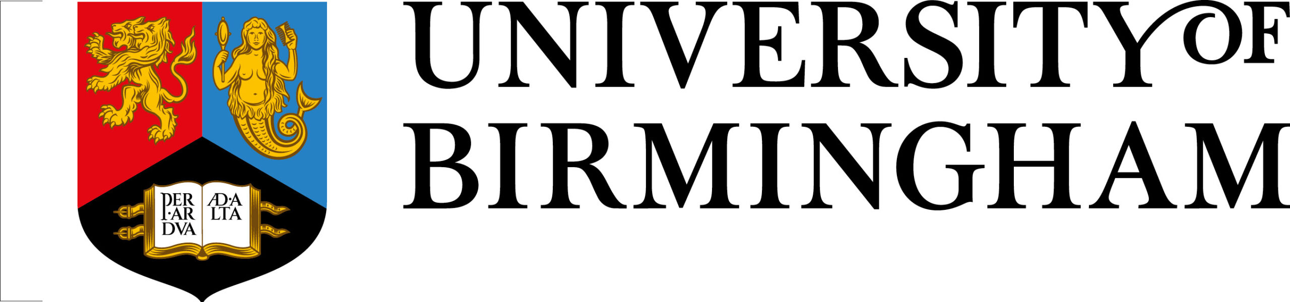
Primary logo
Minimum height
Print – 7mm
Digital – 20px
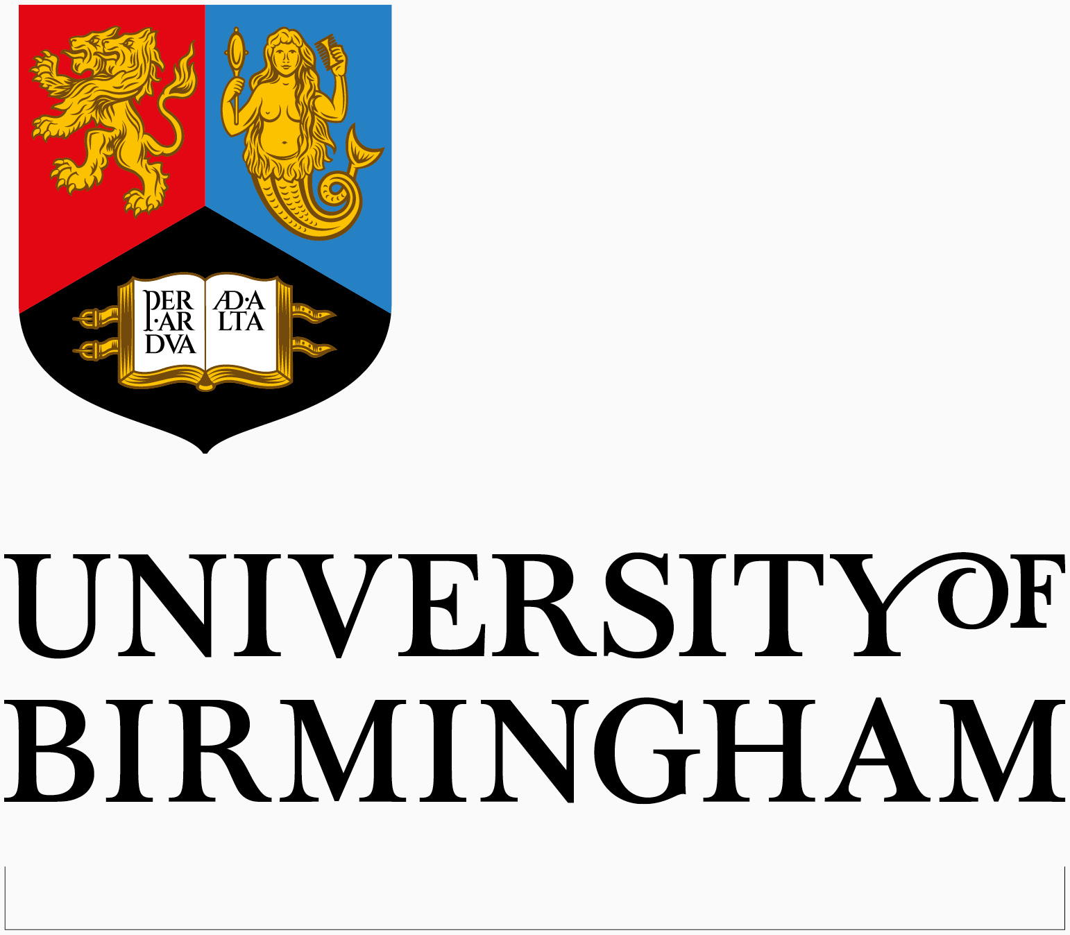
Primary stacked
Minimum width
Print – 16mm
Digital – 45px
Crest
Minimum height
Print – 7mm
Digital – 20px
Logo usage
When using the University logos, it’s crucial their visual integrity is maintained and they aren’t misused. Here you can find some examples that give guidance on how the logos should be correctly used and what must be avoided. Altering or manipulating preset logos is strictly prohibited, as this may make the logo inaccessible to our audiences.
This list doesn’t cover every eventuality, but gives an overview for best practice. The examples shown here apply to other versions, variations and lockups within our logo suite. If a new logo lockup is needed for any area within the ecosystem, then please contact the Brand Team for further guidance.
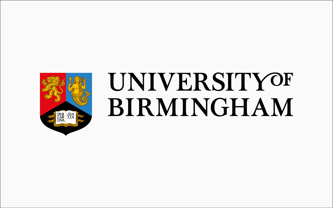
Be clear and legible

Use high contrast with background image
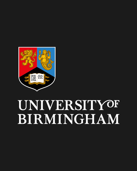
Use correct version for format
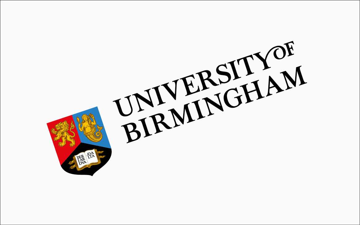
Rotate
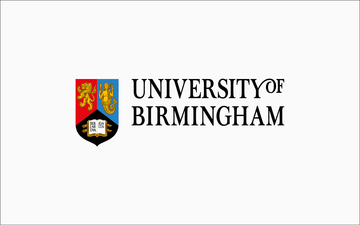
Squeeze or stretch
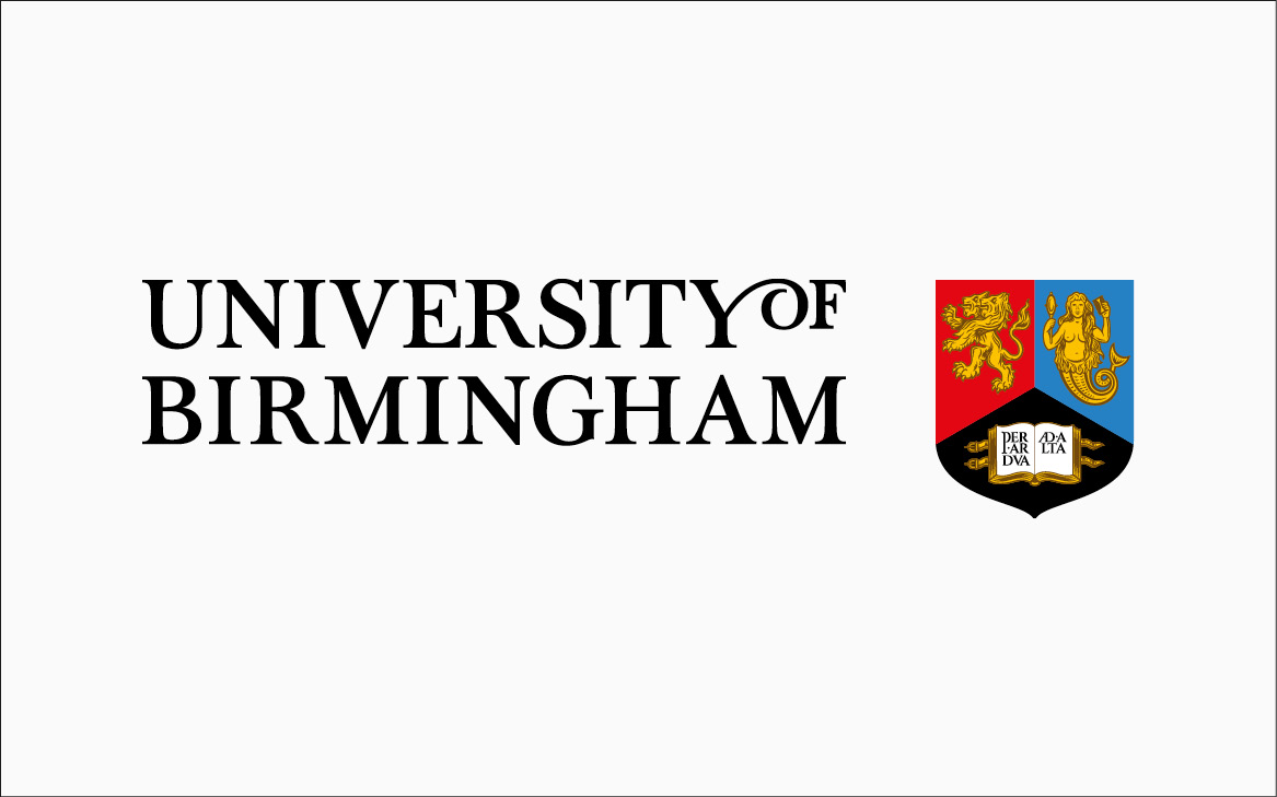
Reconfigure
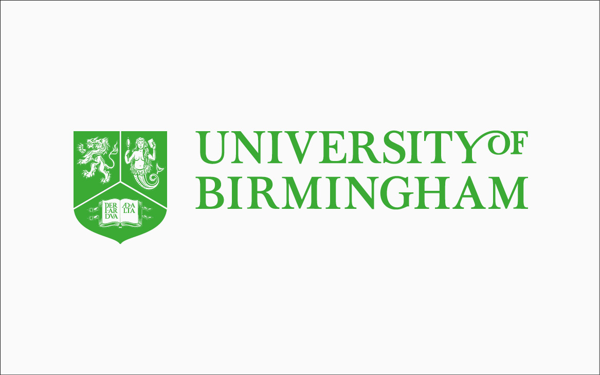
Use unapproved colours
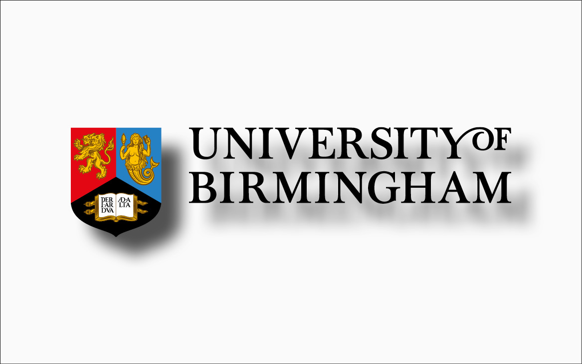
Use drop shadow
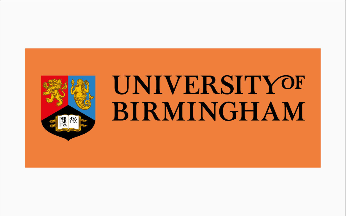
Place in container
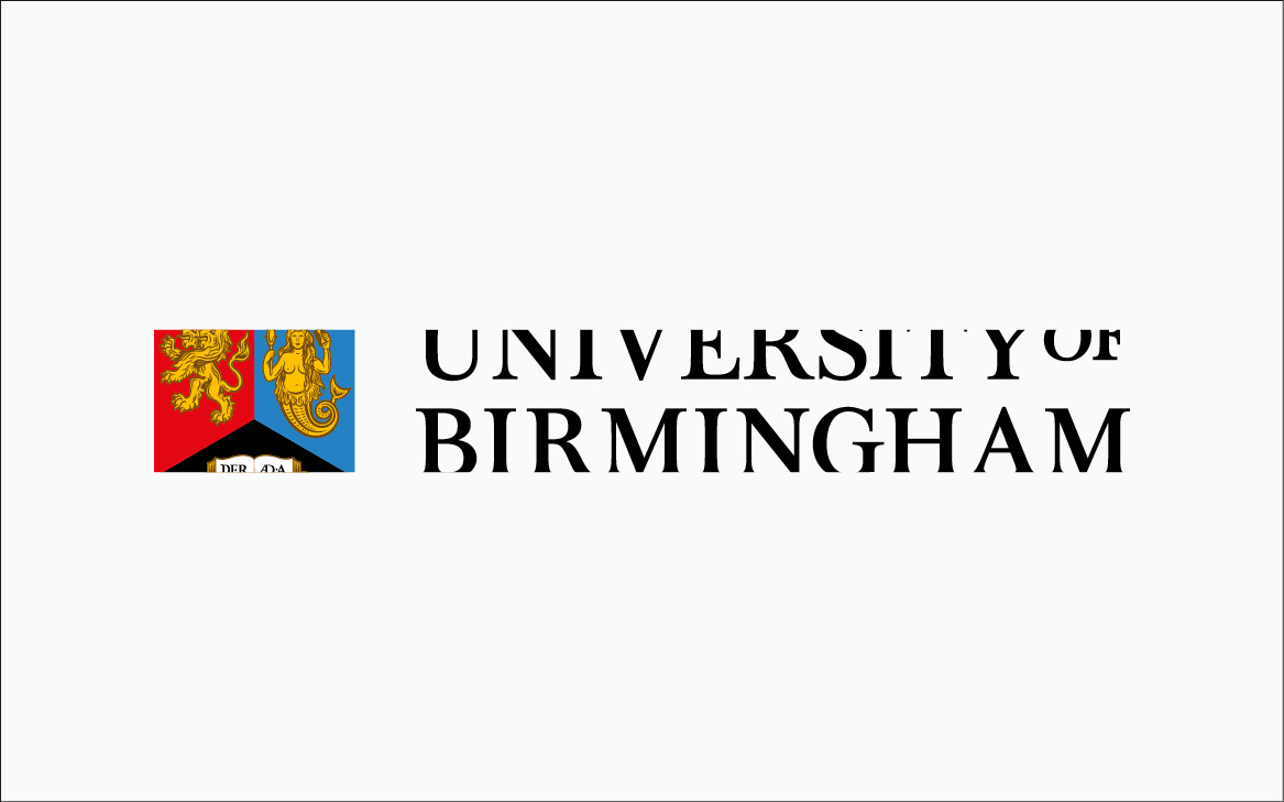
Crop
Recreate
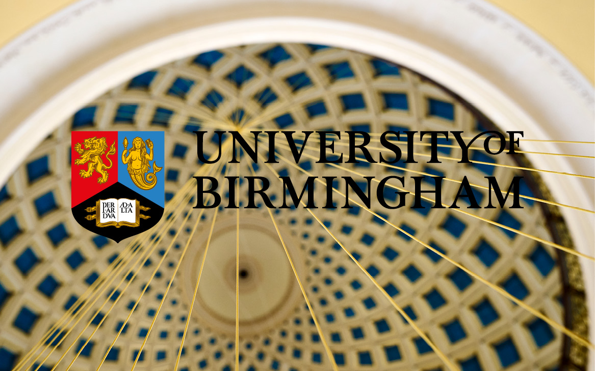
Place on low contrast, busy backgrounds
Logo placement
Placing the logo correctly on a given format will be vital to promoting and maintaining the strength of the brand. Here you can find guidance on where and which type of logo should sit on a format.
Because there are an infinite amount of formats that can be created, which will affect the placement of the logo and the type chosen, it’s not possible to cover every eventuality, so an element of good design sense will have to come into play when designing with formats that don’t perfectly match the examples shown here.
We recognise that there could be elements within the layout of a design piece that could affect the placement of the logo, so these guides have been created with flexibility in mind.
Portrait format
For these types of formats, we suggest that the primary logo should be used as first preference. The logo should sit at the bottom and top left corners or anywhere along the left hand side of the format.
If necessary, it can also sit in the bottom and top right corners, depending on the content of your design piece.
In certain instances, such as on printed presentation boards or documents, the logo can be centred at the top or bottom of a format.
Thin and extreme portrait format
For thinner portrait formats, the primary logo should be set centrally at the top or bottom of the format. For more extreme portrait formats, the primary stacked logo should be used and should be set centrally at the top or bottom of the format.
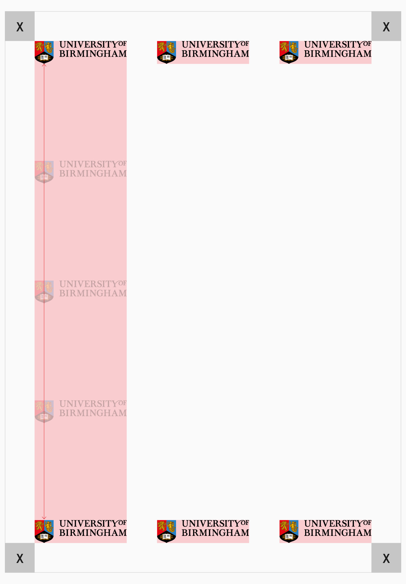
Portrait
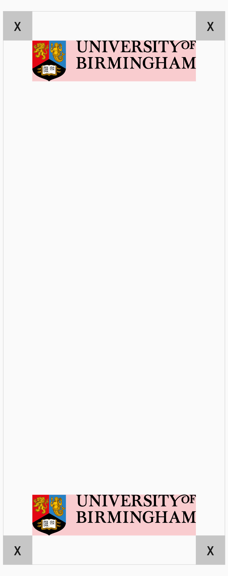
Thin portrait
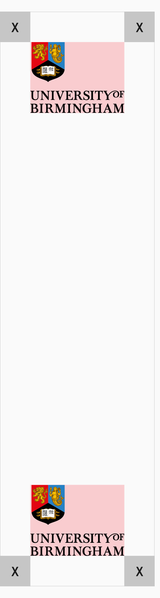
Extreme portrait
Landscape format
For these types of formats, we suggest that the primary landscape logo should be used as first preference. The logo should sit at the bottom and top left corners or anywhere along the left hand side of the format.
If necessary, it can also sit in the bottom and top right corners, depending on the content of your design piece.
In certain instances, such as on printed presentation boards or documents, the logo can be centred at the top or bottom of a format.
Thin and extreme landscape format
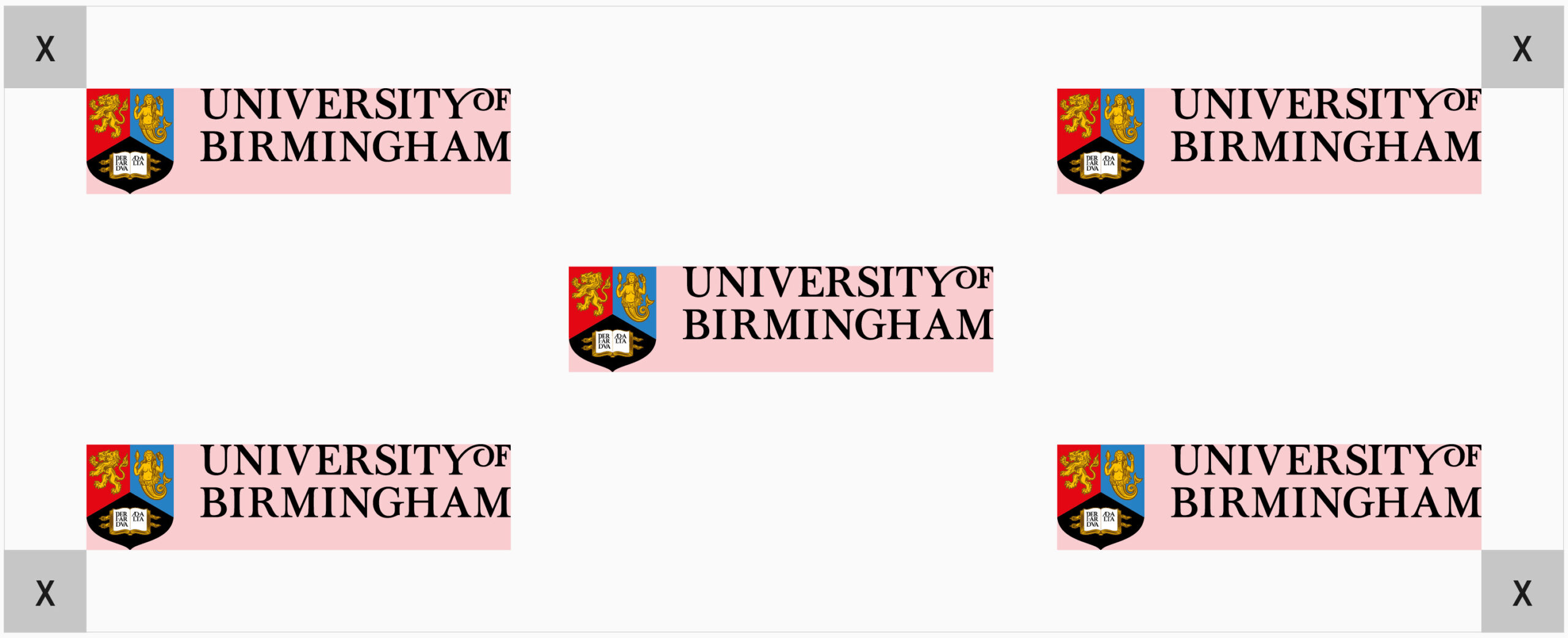
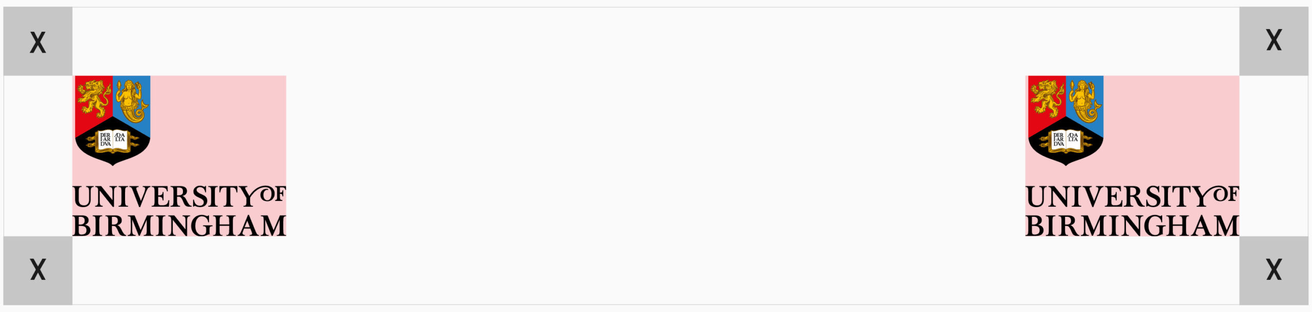
For thinner landscape formats, the primary logo should be set primarily in the top or bottom left corners. The logo can also sit in the top or bottom right corners and centred, if necessary. For more extreme landscape formats, the primary logo should be used and should be set centrally on the left and right sides of the format.
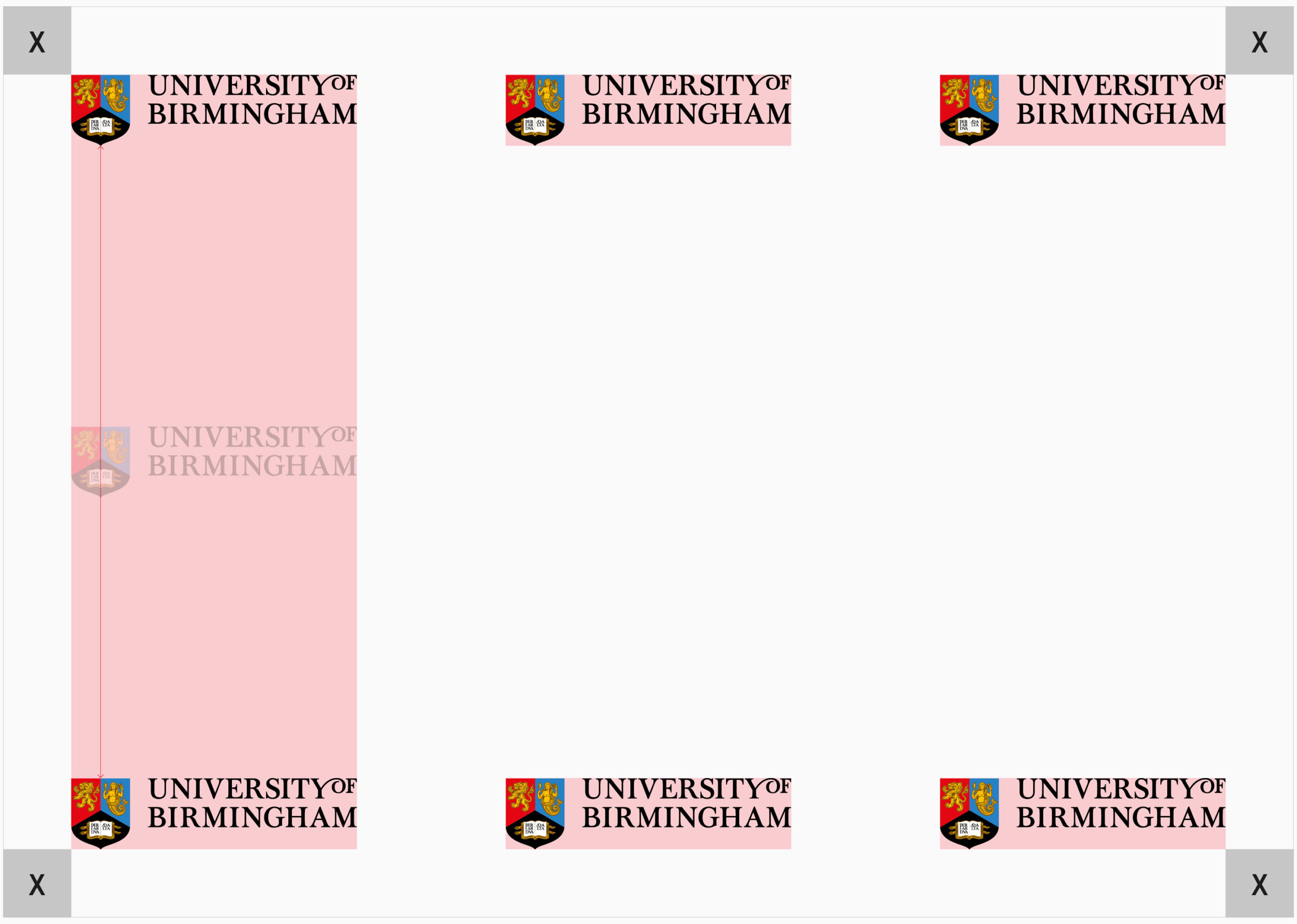
Square format
For these types of formats, we suggest that the primary landscape logo should be used as first preference. The logo should sit at the bottom and top left corners or anywhere along the left hand side of the format.
If necessary, it can also sit in the bottom and top right corners, depending on the content of your design piece.
In certain instances, such as on printed presentation boards or documents, the logo can be centred along the top or bottom of a format.